TAChart Demos
Introduction
TAChart is Lazarus' powerful charting library. It consists of numerous classes and declarations distributed over some 50 units. New users may be overwhelmed by the complexity of usage, and even experienced charters still find gems from time to time.
In order to demonstrate the possibilities of TAChart a variety of demo projects has been written. They are stored in the directory components/tachart/demo of the Lazarus installation. However, there is no overview of these examples, and it is often quite cumbersome to find a certain application of interest. Therefore, it is the intention of this wiki page to provide some kind of catalogue of the TAChart demos. Each demo project will be accompanied by a short description and a screen shot of the program output.
Gallery
Click on the captions to go to the description of that particular demo project. Click on the thumbnail to see the screenshot at normal size.
Demo folders
3d
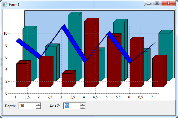
The project zdemo in the folder 3d illustrates creation of a simple 3d effect in TAChart. Some series types have a property Depth allowing to extrude the series into the third dimension. Using the property ZPosition the series can be "shifted" back and forth into the depth dimension. The same property allows to move the axes and the grid to the front.
aggpas
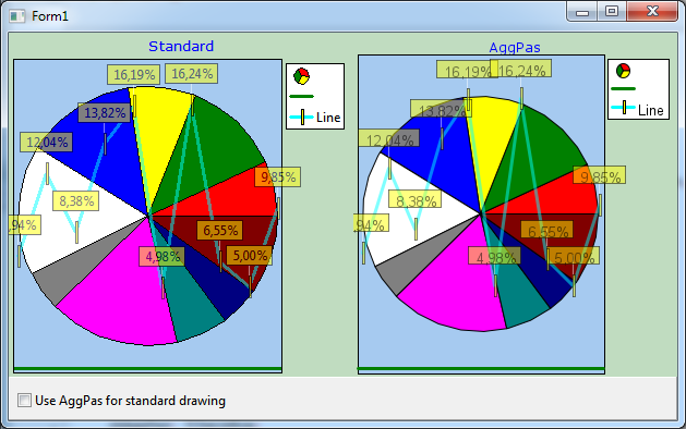
For improved rendering quality, TAChart can take advantage of the fast and powerful AggPas library with anti-aliased drawing and subpixel accuracy. The project aggpasdemo shows the necessary code to achieve this:
- Add a TChartGUIConnectorAggPas to the form and assign it to the property GUIConnector of the form
- Or, use a TPaintbox and use the code given in TForm1.PaintBox1Paint in its OnPaint event.
Note that this feature is not yet available in Lazarus 1.2 and requires the trunk version. Packages AggPasLCL and TACharstAggPas are needed to compile the demo.
animate
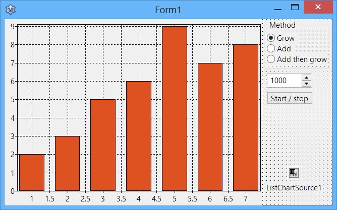
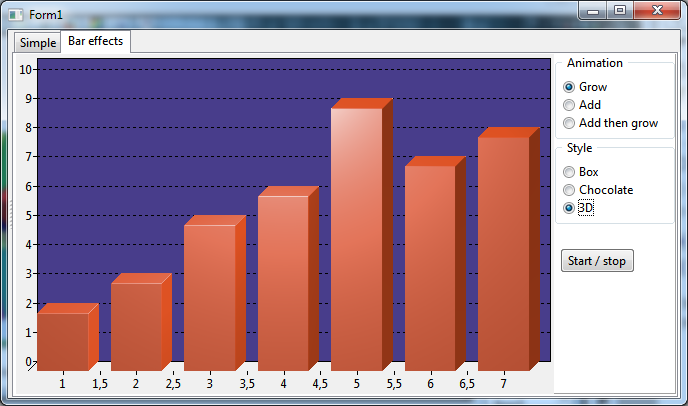
The animatedemo presents animation of a bar chart. The main animation work is done by a TCustomAnimatedChartSource created at runtime and its OnGetItem event.
axis
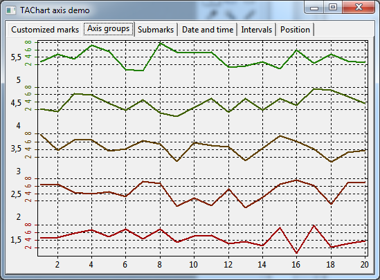
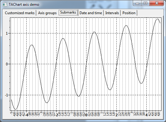
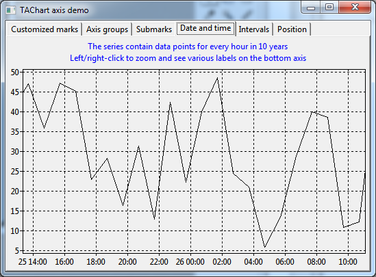
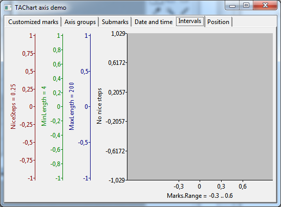
The project "axis" shows some fundamental and advanced aspects of axis formatting and layout in a multi-page form:
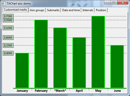
Page Customized marks demonstrates how painting of the marks of an axis can be controlled by modifying their properties, such as Marks.LabelBrush, Marks.Frame, or Marks.LabelFont. Highlighting of individual marks can be done by assigning a handler to the axis event OnMarksToText:
procedure TForm1.ChartCustomMarksAxisList1MarkToText(var AText: String; AMark: Double);
begin
  if AMark = 3 then
    AText := '*' + AText + '*';
end;
In page Axis groups it is shown how a chart layout with multiple axes can be created. The TAChart Tutorial: Multiple Panes in one Chart explains the required steps in detail.
In the demo, the axes and required axis transformations are created at runtime.
In the next page, Submarks, a minor axis is used along the x axis, and smaller labels are drawn for each tick of the minor axis. This effect is achieved by adding an additional axis to the property Minors. Minor axes have their own set of marks and labels.
Displaying an axis with date and time data is the subject of page Date and time. The series displays random data for every hour in a 10-year date range. Zoom in by clicking with the left, zoom out by clicking with the right mouse button. For every zoom level the TDateTimeIntervalChartSource manages to displays reasonable labels along the x axis.
The most prominent feature of the demo in page Intervals is that the same y data are displayed on several axes with different settings of the Intervals property. The x axis demonstrates how the range of displayed labels can be limited by means of the axis property Marks.Range.
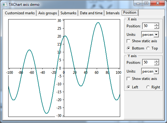
Page Position demonstrates that axes do not have to be at the edge of a chart. In plots of mathematical function, for examples, the axes usually run through the origin at x=0 and y=0. Modifying the property Position of an axis allows to place it at any position. The demo shows also how an additional axis can be added at the chart edge.
axisalign
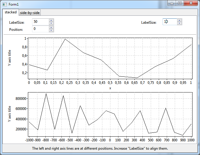
In new TAChart versions after Lazarus 1.2.6, the chart axis has a new property LabelSize which - if different from 0 - overrides the automatic axis positioning mechanism. Therefore, this property can be used to align the axis lines of charts which are stacked or positioned side-by-side and in which the axis labels have different lengths.
axistransf
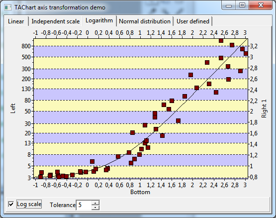
The subject of the project "axistransf" are axis transformations which are the key to non-linear or distorted axis scales. Several charts are combined into a multi-paged form.
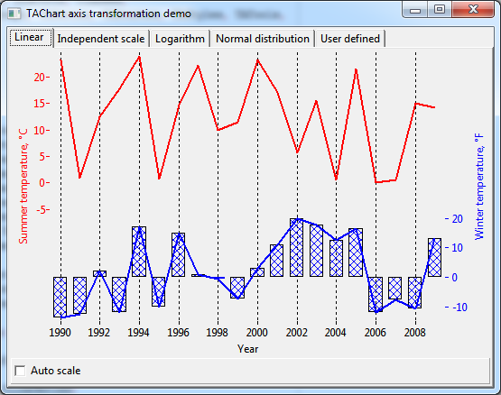
The chart on page Linear shows two temperature curves which are displaced for better clarity. The summer temperatures are shown as a red curve, the labels are at the left y axis; the winter temperatures are shown as a blue curve (and overlayed bar series) and have their labels on the right y axis. Both axes cover only part of the available space to separate the data.
This effect can be achieved by using auto-scale axis transformations.
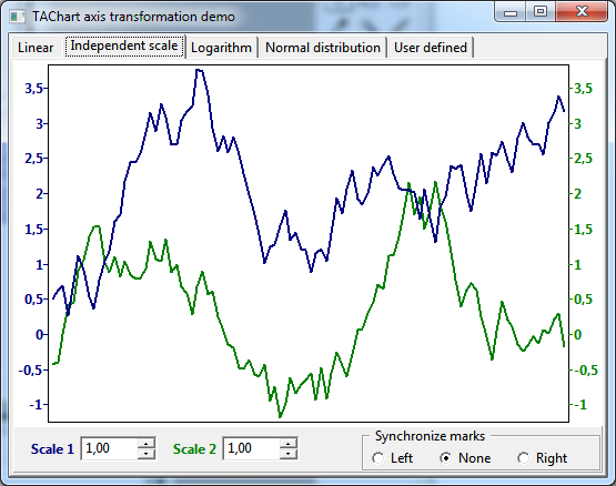
The demo Independent scale covers the same subject.
See TAChart Tutorial: Multiple Panes in one Chart for a detailed explanation of the steps required.
A plot with logarithmic axis is displayed on page Logarithm. The striped background layout is achieved by means of a TChartStyles component.
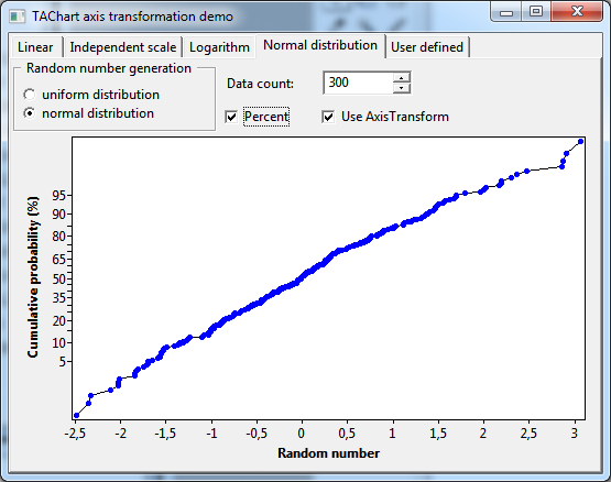
Page Normal distribution shows a series with random data, their statistical distribution follows a Normal Distribution. Using a TCumulNormDistrAxisTransform the cumulated probability distribution can be distorted to follow a straight line.
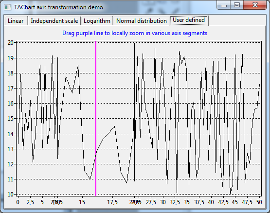
The chart on page User defined contains a purple vertical line which acts like a magnifier: The series is zoomed horizontally in the vicinity around this line. Dragging the line allows to blow up any part of the series.
This local zoom effect is achieved by means of a TUserDefinedAxisTransform. In this transform, the axis transformation is defined by the handler of the event OnAxisToGraph.
barseriesshapes
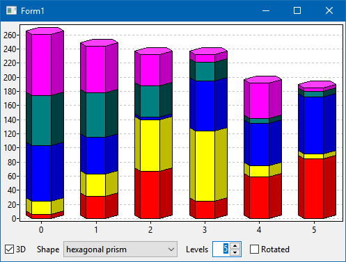
Demonstrates usage of alternative bar shapes in 3D TBarSeries.
basic
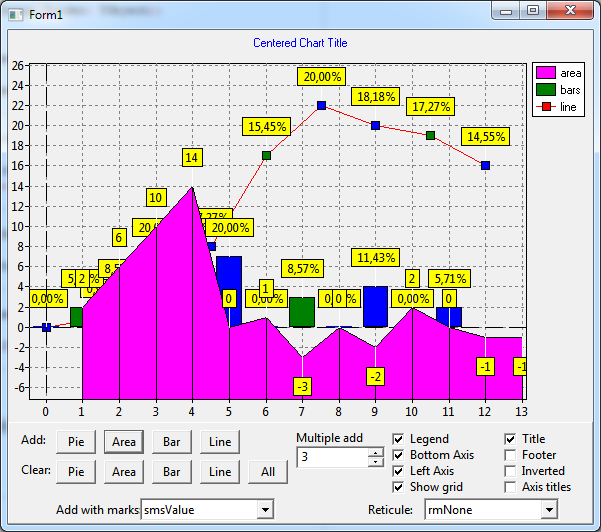
Basic operation with charts and series is demonstrated in the basicdemo project. The demo shows
- how to create a series at runtime and add it to the chart
- how to add data to a series (series.AddXY(...))
- how to clear series (Chart1.ClearSeries)
- how to change the z position of a series (TForm1.BringToFront)
- how to show/hide axes, axis grid, titles and the legend
- how to invert the axis direction
- how to show a crosshair marker. Note, however, that usage of the reticule is deprecated now, use zoom tools instead.
bgra
For improved rendering quality, TAChart can take advantage of the fast and powerful BGRABitmap library with anti-aliased drawing and subpixel accuracy. The project bgrademo shows the necessary code to achieve this:
- Add a TChartGUIConnectorBGRA to the form and assign it to the property GUIConnector of the form
- Or, use a TPaintbox and use the code given in TForm1.PaintBox1Paint in its OnPaint event.
Packages bgrabitmappack and TAChartBgra are needed to compile the demo.
charteditordemo
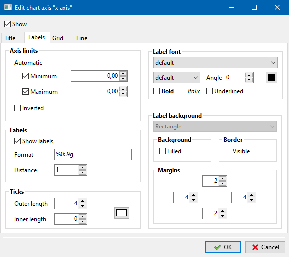
The charteditordemo project shows a gui how the user could interactively change most elements of a chart. Besides the TDataPointClickTool, the project relies strongly on the dedicated chart tools TTitleFootClickTool, TAxisClickTool and TLegendClickTool which were introduced in Lazarus v2.1.
chartsource
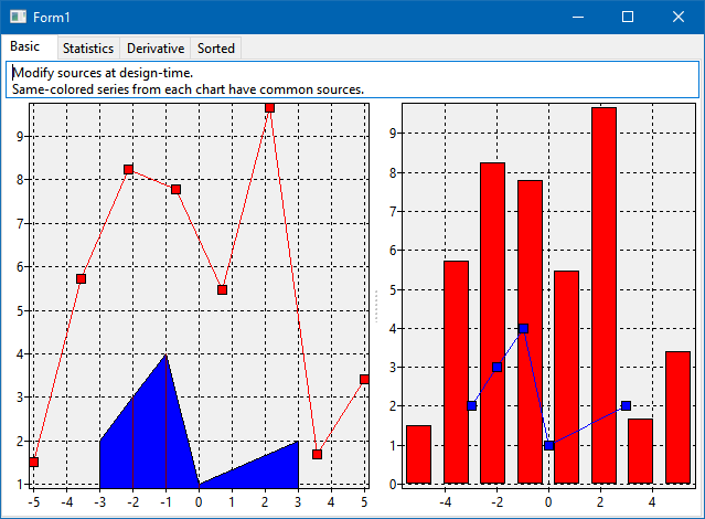
The demo project chartsource illustrates various use cases for chart source components
Page 'Basic demonstrates that the same chartsource can be attached to several series and be used in several charts. In this example data are provided by means of a TListChartSource and a TRandomChartSource.
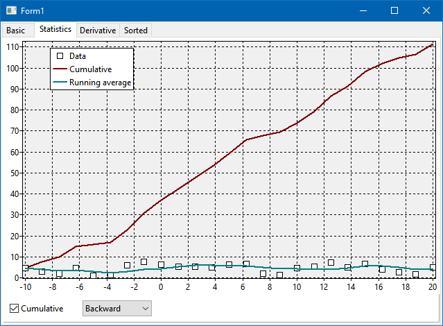
Page Statistics illustrates some applications of the TCalculatedChartSoruce: cumulative sums and moving average
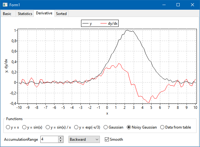
Page Derivative highlights numerical calculation and plotting of derivatives of data series using the TCalculatedChartSource.
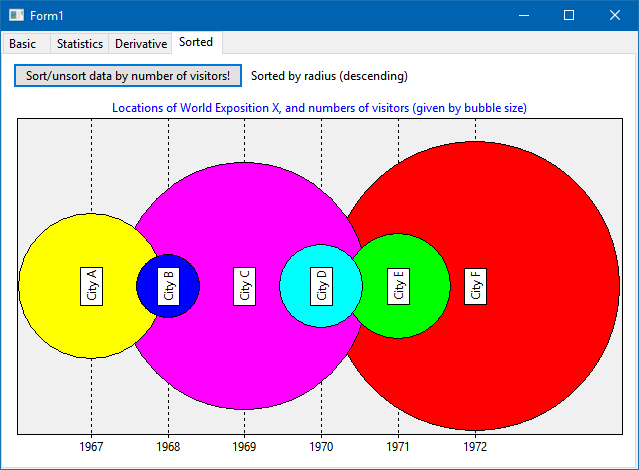
Page Sorting shows how the data values of a TUserDefinedChartSource can be sorted by means of a TSortedChartSource having it as Origin. This is an interesting application for a TBubbleSeries: when the data points are sorted by radius (y value with y index 1) in descending order the bubble are drawn from back to front. Therefore, it is not possible that bubbles are completely covered by anothers.
clone
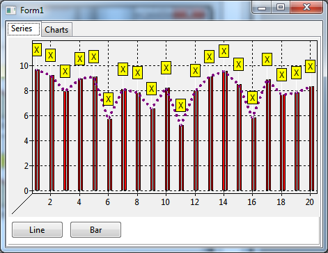
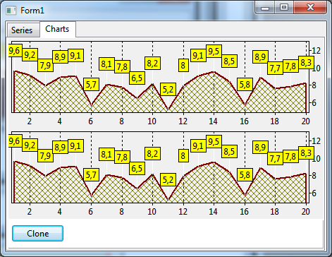
Page Series of the "clonedemo" demonstrates how a series can be duplicated ("cloned"):
  bs := TBarSeries.Create(Self);
  bs.Assign(ChartSeries.Series[i]);
  bs.BarOffsetPercent := bs.BarOffsetPercent + 20;
  ChartSeries.AddSeries(bs);
Cloning of a chart, on page Charts, is even simpler:
ch := Chart1.Clone;
combobox
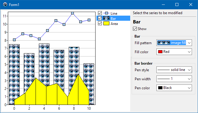
Application of the TChartCombobox is demonstrated by project "combodemo". It contains a chart with a line, bar and area series and has a sidebar for editing the appearance of these series. Brush and pen styles, pen widths and line series pointer styles can be changed by using this decicated multi-featured combobox. The standard TColorBox is used for modifying colors.
distance
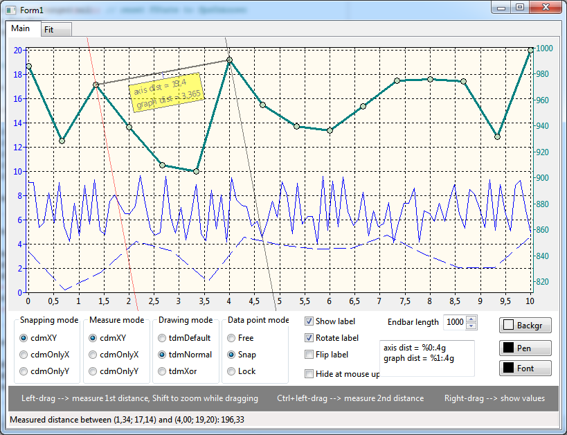
The TDataPointDistanceTool was designed to measure the distance of data points in a chart. The distancedemo demonstrates is application.
Page Main allows to play with the main parameters of the tool. Use the left button to drag a measurement bar across the screen. The mouse-down event determines the starting point, while during dragging the end point is defined by the current mouse position. The distance is displayed in a label above the measurement line. The label can be turned off by setting the tool's Marks.Visible to false. Rotation of the label along with the measurement bar is controlled by some of the tool's Options. The properties DataPointModeStart and DataPointModeEnd determine whether the measurements starts or ends, respectively, at arbitrary points in the chart (dpmFree), or only at data points (dpmSnap or dpmLock, where dpmLock means that the measurement line is only visible when the mouse is near data points, in case of dpmSnap it is always visible but jumps to the next data point when the mouse gets close enough).
Press the ⇧ Shift key while the left mouse button is down to zoom into the chart by a given factor; zoom returns when ⇧ Shift is released (code in TForm1.ctDistance1BeforeKeyDown).
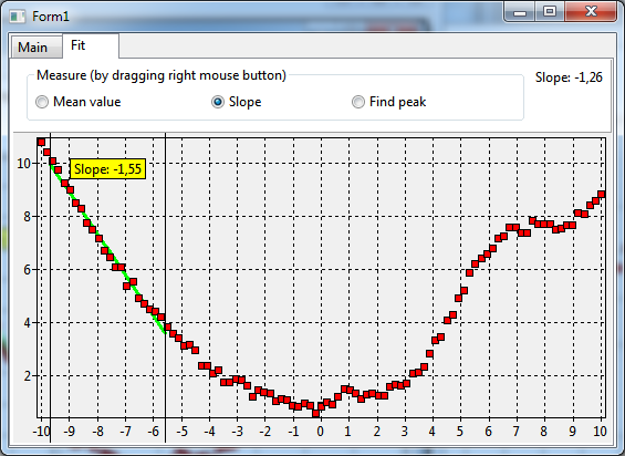
Page Fit shows a more advanced application of the distance tool. It uses its OnGetDistanceText event to fit a polynomial to the data between the start and end points of the measurement line. Fitting is done by means of a TFitSeries. The radiobuttons at the top ("Mean", "slope", "find peak") determine the degree of the fitted polynomial (0, 2, or 2, respectively). The fitted curved is drawn between the end points of the measurement line. For the code, see TForm1.ctFitDataPointDistanceTool1GetDistanceText.
This kind of measurement is initiated by dragging with the right mouse button, while the left-drag controls a standard zooming process.
(Note that this part of the demo is not working properly in Lazarus 1.2).
events
TAChart exposes several events to control the appearence of the chart beyond the properties provided in the object inspector. The project eventdemo shows the effect of three typical events:
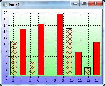
- TChart.OnBeforeDrawBackground is called before painting the entire background rectangle of the chart. The demo shows how the background can be drawn as a gradient.
- TChart.OnBeforeDrawBackWall is a possibilty to replace painting of the backwall of the chart by a user-provided procedure (the "backwall" is the rectangle enclosed by the chart axes). Here, the backwall is drawn as another gradient.
- BarSeries.OnBeforeDrawBar allows to intercept the drawing process of a bar series. In the demo every other bar is drawn in a different fill style.
All events provide a parameter ADoDefaultDrawing to skip the built-in drawing procedure if set to false. In the BarSeries example the 5th bar is dropped by this way.
extent
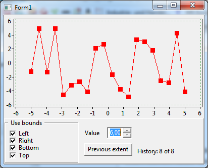
The project extentdemo shows how the extent of a chart, i.e. the start and end of each axis, can be modified (properties Chart.Extent.XMin, Chart.Extent.UseXMin, etc.).
In addition the demo provides code how to setup an extent history which is interesting for undoing extent changes by zooming and panning (see tutorial on "ColorMapSeries, zooming").
financial
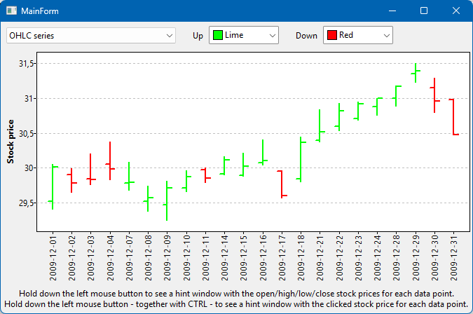
The project financialdemo demonstrates how financial stock data can be plotted by means of an OHLCseries in OHLC and candlestick mode.
fit
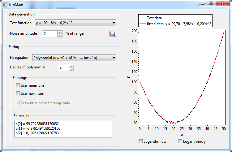
Basic fitting of equations to data by means of TFitSeries is illustrated by project fitdemo. The demo shows
- how to select the fitting function and the number of fitting parameters (TFitSeries.FitEquation, TFitSeries.ParamCount).
- how to restrict the data range for fitting (TFitSeries.FitRange)
- how to extract the values of the fitted parameters (TFitSeries.Param[])
In addition, the usage of logarithmic x and/or y axes is demonstrated.
func
The project funcdemo gives examples of the usage of function series.
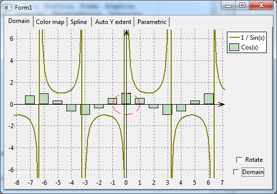
The first page of this multi-tab project, Domain, demonstrates the TFuncSeries. This series plots a mathematical function. The function values are passed to the series by means of an event handler for OnCalculate. This series type has the advantage that the plot is always smooth independent of zooming. The function y=1/sin(x) drawn in the screenshot at the right is not defined for integer multiples of pi. Therefore, standard output draws vertical connection lines at these points. This artefact can be avoided by adding the points with undefined function values to the DomainExclusions of the series. Click at "Domain" to see this effect.
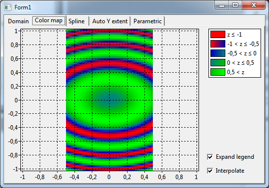
The TColorMapSeries shown on page Color map is similar to TFuncSeries, however, it requires an x and y value to calculate the function value z which is encoded as a color. The calculation is done again in the event handler for OnCalculate. The colors are assigned to the z values by means of a ListChartSource which is assigned to the ColorSource property of the series.
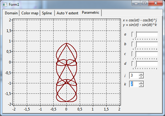
Page Parametric shows another function series requiring an OnCalculate event handler, the TParametricCurveSeries. Here, a single parameter (t) is used to calculate the x and y values. The example shows the parametric function defined by
x(t) = cos(a*t) - cos(b*t)^j
y(t) = sin(c*t) - sin(d*d)^k.
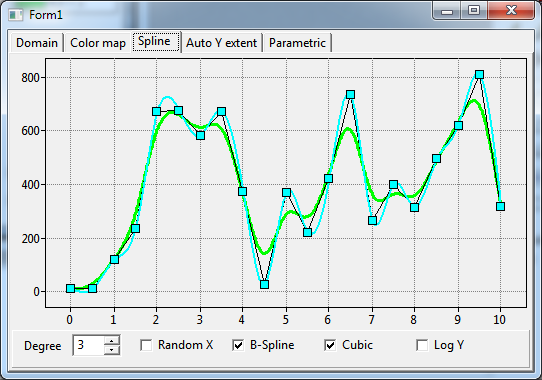
The TCubicSplineSeries shown on page Spline is similar to a standard TLineSeries (black), but the data points are not connected by straight line segments, but by smooth cubic spline curves (bright blue). The TBSplineSeries (green) is similar, but the spline does not pass through the data points and, therefore, achieves even better smoothing.
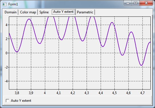
Page Auto y extent gives a solution to the problem that it is normally not possible to automatically adjust the y axis to the extent of data values. TFuncSeries was equipped with a property ExtentAutoY which has to be enabled for this purpose.
html
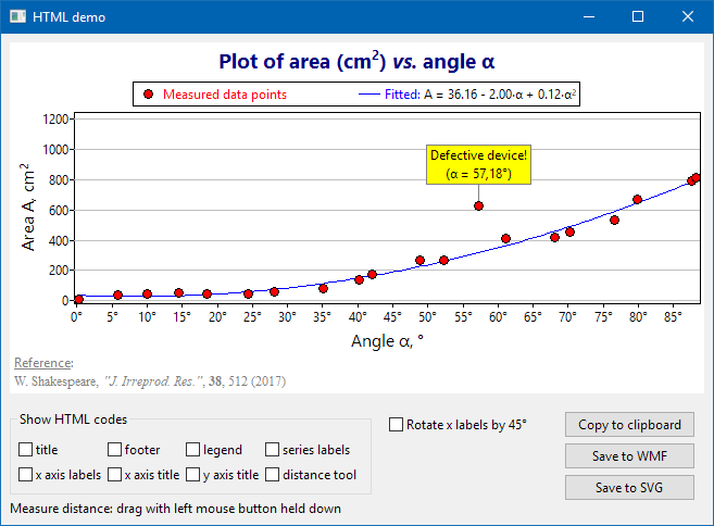
Embedding of html tags and entities in TAChart text elements is demonstrated by the project html. This feature is activated by setting the TextFormat of the corresponding text element to tfHTML. The codes used can be show by checking the corresponding checkboxes; the title of the x axis, for example, is written as 'Angle α, °'.
The buttons "Copy to clipboard", "Save to WMF" and "Save to SVG" demonstrate that this special formatting is retained when copying a chart to the clipboard or when saving it to a graphics file.
legend
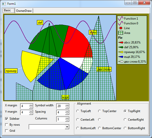
The project legenddemo demonstrates how the legend of the TChart component can be used and modified. (Please note that after Lazarus version 1.2 the project window contains two pages; in older versions, only the first page is available).
Page Basic demonstrates fundamental work with the legend:
- showing series names (series.Legend.Multiplicity = lmSingle)
- showing series data (series.Legend.Multiplicity = lmPoint, demonstrated for the pie series)
- owner-drawing series icons for the legend by means of the event OnDrawLegend of a series (see procedure Chart1FuncSeries1DrawLegend)
- using legend group titles (Chart.Legend.GroupTitles)
- manually adding legend items (event series.Legend.OnCreate, demonstrated for Chart1FuncSeries1). Note the workaround for a bug in FormCreate.
- run-time modification of properties for positioning of the legend.
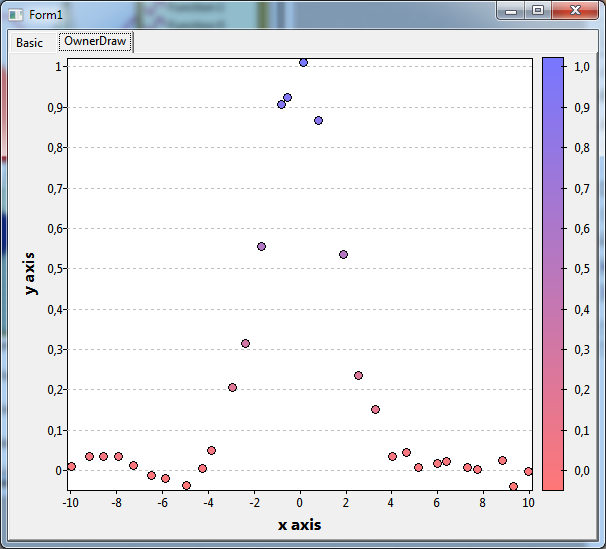
The second page (OwnerDraw) explains how the legend can be drawn as a gradient bar. For this purpose an event handler must be written for the chart's event OnDrawLegend. The gradient is drawn by calling the following procedure:
procedure DrawGradient(ADrawer: IChartDrawer; ARect: TRect;
  AStartColor, AEndColor: TColor);
var
  y,h: Integer;
  c: TColor;
begin
  h := ARect.Bottom - ARect.Top;
  if h <= 0 then exit;
  for y := ARect.Bottom-1 downto ARect.Top do begin
    c := InterpolateRGB(AStartColor, AEndColor, (ARect.Bottom - y) / h);
    ADrawer.SetPenParams(psSolid, c);
    ADrawer.Line(ARect.Left, y, ARect.Right, y);
  end;
end;
line
The linedemo illustrates some aspects of line series.
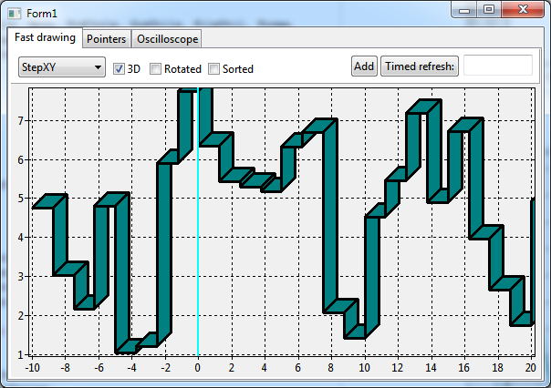
Page Fast drawing:
- Change the selection of the combobox to switch between different LineTypes of the series. The screen shot at the right is created with the setting LineType = ltStepXY.
- Create a 3D look by checking the option "3D".
- Interchange the x and y axes by checking "Rotated".
- Quickly add 600,000 data points and measure the time for a refresh.
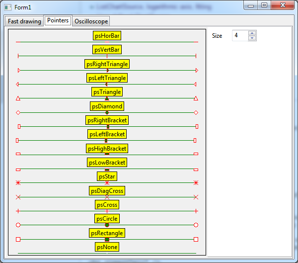
Page Pointers shows a list of all pointers that are available for data point markers. The chart is created by using a lineseries with three data points for each pointer Style. The name of the style and a different color have been assigned to the center data point in the AddXY method of the series. The size of the pointers can be changed at runtime.
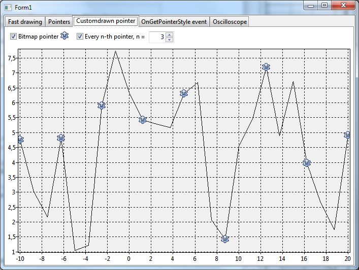
Page OnCustomdrawn pointer demonstrates how a bitmap can be used as a data pointer, and how only every n-th pointer can be drawn. This is done by means of the event OnCustomDrawPointer.
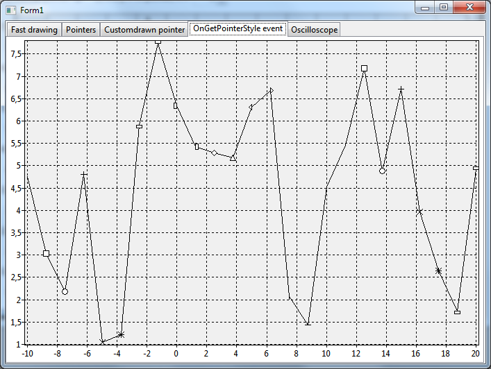
Using the event OnGetPointerStyle the pointers of individual data points of a line series can be changed. This is demonstrated on page OnGetPointerStyle..
Page Oscilloscope:
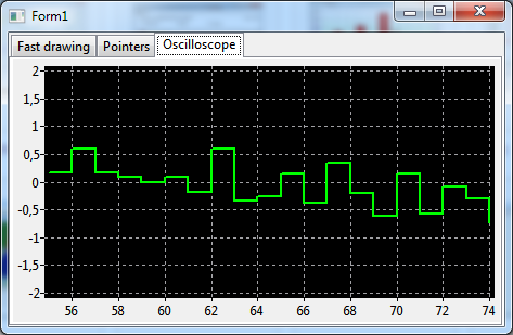
Driven by a timer, more and more data points are added to the line series. The oldest data point is deleted once the series contains more than 20 points. The series is updated continously and is drawn using LineType=ltStepXY. The OnTimer event handler of the timer contains code to allow zooming into various parts of the chart while preserving the "oscilloscope" behavior.
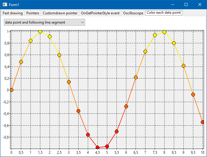
Page Color each data point applies the lineseries property ColorEach for colorizing individual datapoints and/or the adjacent line segments. The color is passed as the 4th parameter of the series method AddXY(x, y, text, color).
listbox
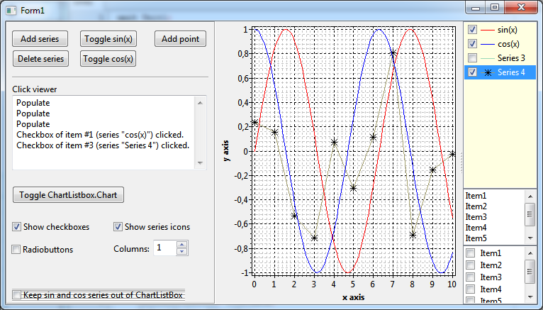
TChartListbox is a useful add-on to TAChart for interactively turning selected series on and off. Just add a TChartListbox to the form and link its Chart property to the chart of interest. The project listboxdemo demonstrates that there is a two-way communication between chart and listbox: when listbox items are checked/unchecked the corresponding series are shown/hidden. Conversely, when series are added/deleted/shown/hidden in the chart the changes are reflected in the listbox automatically.
liveview, liveview-paned
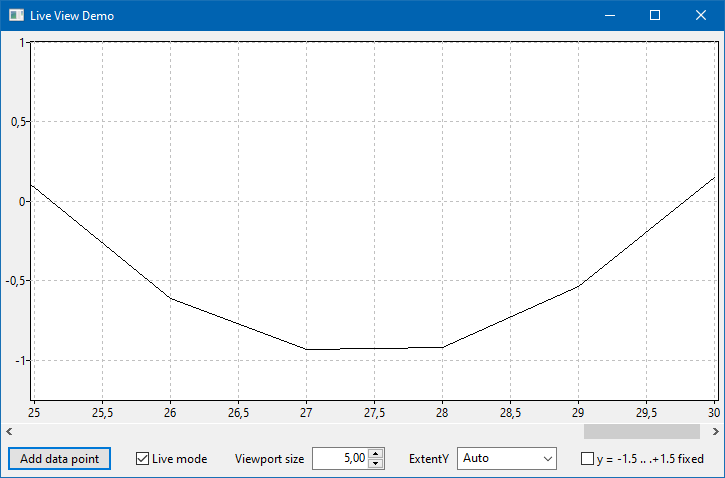
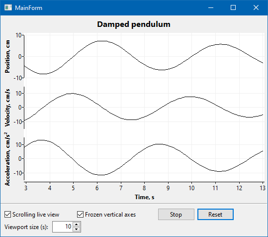
These two projects demonstrate usage of the TChartLiveView component which displays, in a scrolling viewport, only the most recent data points arriving from some external source.
In order to apply a TChartLiveView set its Chart property to the chart to be controlled. Set Active to true to activate the live view. Property ViewportSize determines the width of the scrolling window in axis units.
While the liveview project applies to a normal chart with a single y axis, usage of several y axes is demonstrated in the liveview-paned project.
The creation of a "paned chart" with several axes is the subject of the demo panes.
multi
Usage of series with multiple y values is the subject of project multidemo. TListChartSource provides storage for additional y values in the array YList[].
See TAChart documentation of more details.
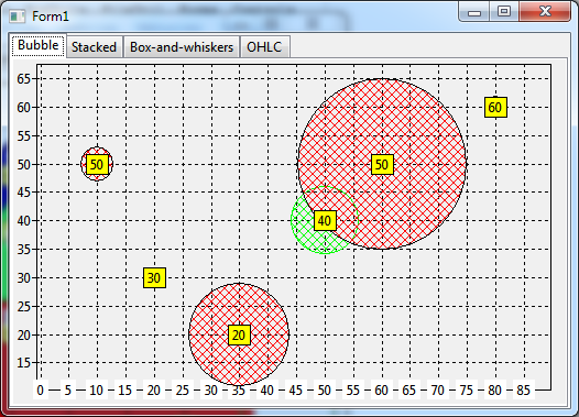
Page Bubble shows a chart with a bubble series. This series draws data points as circles of variable radius centered at the data points. In addition to the standard x/y coordinates there must be a second y value to specify the radius. Since - as usual - a color value can be assigned to a data point bubble charts can show four-dimensional data.
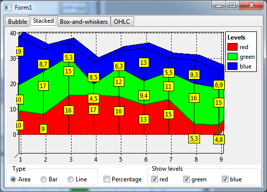
Page Stacked shows stacked area, bar, or line series charts. Stacked series must provide a y value for the each stack levels. The TChartStyles component is used to define the color of the stacks.
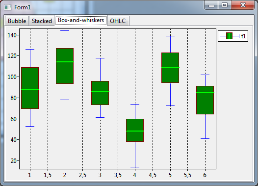
A chart with a Box-and-Whiskers-Series is displayed in page Box-and-Whiskers. This series type represents data as rectangles ("box") with a medium line and two T-shaped protrusions in both directions ("whiskers") . It requires five y values:
- Lower whisker
- Lower box edge
- Medium line
- Upper box edge
- Upper whisker
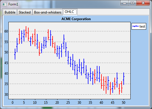
Page OHLC shows a chart with a Open-high-low-close series which represents data as a vertical lines with two ticks and requires four y values:
- Lower point of line = "Low" value
- Left-facing tick position = "Open" value
- Right-facing tick position = "Close" value
- Upper point of line = "High" value
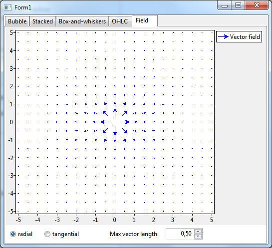
A simple field plot is demonstrated on page Field. This series type draws short arrows at the data points to highlight the directions of a vector field. It requires two x and two y values per data point.
nan
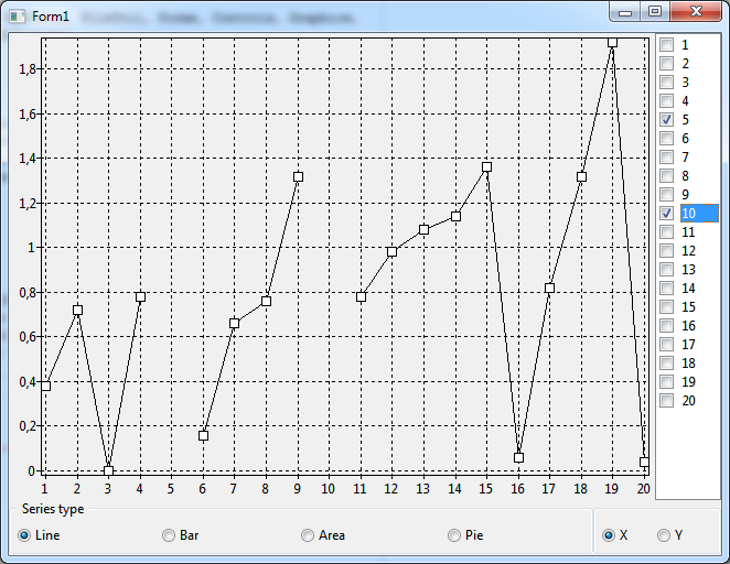
The project nandemo shows how values can be skipped from a series. Click on an x value in the checklistbox at the right to replace the x or y value of the corresponding data point by NaN. In a line series, a NaN value introduces a break in the originally continuous curve. In other series types, the effect is similar. See TAChart documentation of more details.
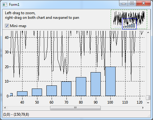
For navigation in a zoomed chart, TAChart provides the components TChartNavScrollbar and TChartNavPanel. Usage of these components is demonstarted in the navigatedemo project.
The chart in which the navigation occurs must be assigned to this corresponding property. Note the property MiniMap which displays a reduced view of the chart and draws the current viewport as a highlighted rectangle.
nogui
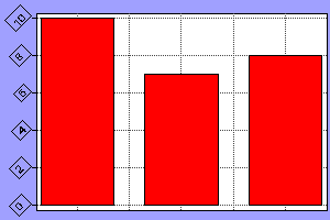
noguidemo demonstrates that TAChart can also be used for creating graphics output from console (no-gui) programs. This project creates a chart and a simple bar series at runtime and stores the output to a png file without a user-interface showing up.
Note that, for Windows, the freetype-6.dll and zlib1.dll are required in the exe folder in order to run the demo.
opengl
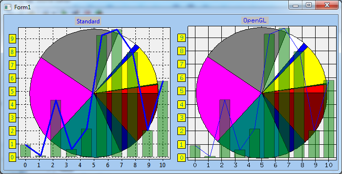
opengldemo presents code how to use OpenGL for improved rendering quality of the chart by means of TOpenGLDrawer. See TAChart documentation for details on this drawer. In addition, the demo illustrates also the usage of series transparency.
Note that the package LazOpenGLContext needs to be installed to compile this demo.
panes
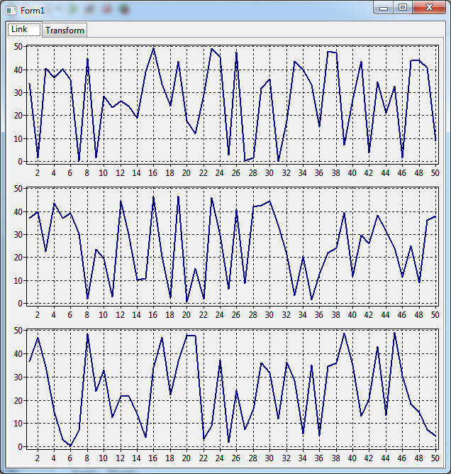
When working with multiple charts in the same window it sometimes required to use common axes. The panes demo projects shows two possibilities how to achieve this:
In page Link there are three charts, each with one series. The axes of the charts are linked by means of a TChartExtentLink component. The axes to be coupled are specified by the Mode property. Zoom in one of the chart by dragging a zoom rectangle with the left mouse button, and the other charts will follow.
In page Transform there is only one chart, but with three series. Each series covers a third of the vertical chart area with its individual y axis. This effect can be achieved by means of three vertical axes and three AutoScaleAxisTransforms.
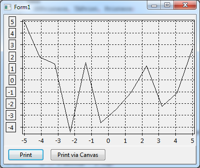
printdemo illustrates two ways of printing charts:
- using direct painting on the printer's canvas by clicking on button "Print via canvas",
Chart1.PaintOnCanvas(Printer.Canvas, ARect)
- or using a dedicated drawer for printing (by clicking on button "Print") which generally yields better quality. Package TAChartPrint is necessary to use TPrinterDrawer. See TAChart documentation for details on TPrinterDrawer.
Chart1.Draw(TPrinterDrawer.Create(Printer), ARect);
In general, printer support requires the package Printer4Lazarus. The demo also shows how axis marks can be highlighted by a border (Chart1.LeftAxis.Marks.Frame.Visible := true).
radial
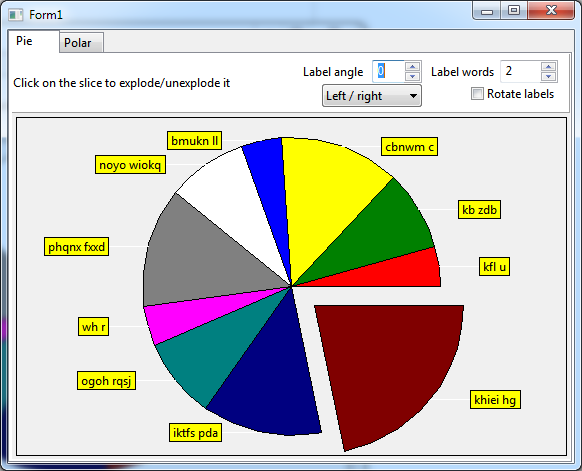
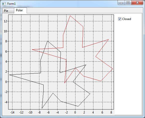
The radialdemo project introduces two series, the TPieSeries and the TPolarSeries. Both interpret the x/y coordinates as angle and distance from center, but in an opposite way.
TPieSeries shown on page Pie assumes that the y value of the chart source is the angle of the pie, and the x coordinate corresponds to the distance of the slice from the center. Therefore, the effect of the "exploded" slice can be achieved by increasing the x value (if property Exploded is set). In addition, the demo allows to play with some properties of the pie series:
- MarkPositions
- RotateLabels
- Marks.LabelFont.Rotation
See section Pie series in the documentation.
The second page Polar shows two polar series. In a polar series, the x value is interpreted as the angle in radians, and the y value corresponds to the distance of the point from the center.
Both series are linked to the same ChartSource. They are offset with respect to each other because the properties OriginX and OriginY are different. The checkbox "Closed" allows to close the polygons (property CloseCircle) by connecting the first data point with the last one.
See section Polar series in the documentation.
rotate
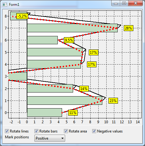
"Rotate" in the context of project rotatedemo means "rotation of a series with respect to the x and y axes", i.e. painting of a series with x and y axes interchanged.
The demo starts with a line series, a bar series and a 3d area series in the regular arrangement of x along the horizontal and y along the vertical axis. After checking the checkbox assigned to a series, its x values are drawn along the vertical and the y values along the horizontal axes. In the rotated configuration the bars of a bar series are drawn horizontally.
In TAChart, this kind of rotation is achieved by assigning the property AxisIndexX to the index of the vertical axis, and AxisIndexY to that of the horizontal axis.
In addition to rotation, the demo project allows also to play with the position of the series marks by changing the property MarkPositions of the red dotted line series.
save
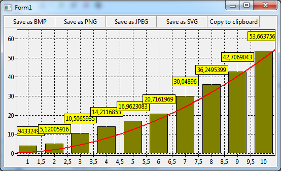
The project savedemo shows code how to save a chart to an external graphics file (.bmp, .png, .jpg, .svg)
Chart1.SaveToBitmapFile('test.bmp');
or to copy it to the clipboard
Chart1.CopyToClipboardBitmap;
script
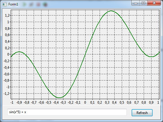
The project scriptdemo applies PascalScript to define the mathematical function shown in a TFuncSeries. In this way a mathematical function plotter can be created.
A tutorial on usage of TFuncSeries can be found here.
tools
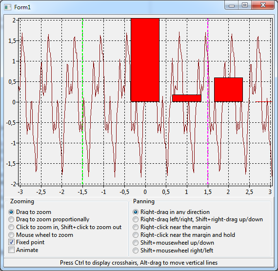
Project toolsdemo gives the opportunity to play with TAChart's zooming and panning tools. Follow the instructions on the screen to activate the individual tools.
Internally, the work is done by the TChartTool components. Have a look at chapter Tools in the TAChart documentation or the tutorial "Chart tools" to learn details on this powerful add-on to TAChart.
wmf
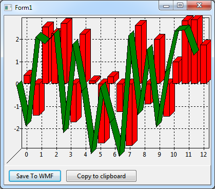
wmfdemo saves a chart to a windows metafile (.wmf):
with Chart1 do
  Draw(TWindowsMetafileDrawer.Create('test.wmf'), Rect(0, 0, Width, Height));

// or, after r46404:
Chart1.SaveToWMF('test.wmf');
Since r46396, a chart can be copied to the clipboard as a windows metafile (windows-only); use an empty file name string in above Draw code for this purpose. After r46404, the simpler Chart1.CopyToClipboardMetafile has the same effect.
Related documents
Main documentation:
Tutorials:
