TAChart Tutorial: Multiple Panes in one Chart
Introduction
This tutorial shows how to create a chart with multiple series in their own panes and with their own left axes and one common bottom axis. It was created while checking out the nice "Panes demo" which you can find in the folder components/tachart/demo/panes of your Lazarus installation. Since a second topic is included in this sample project it may be a bit difficult to catch the basic idea. So here we explain how you can do this from scratch.
The setup of charts, axes, series and panes in TAChart is not done from a single dialog window. Instead you add components and change their settings in the object inspector to get the wanted behaviour.
Three types of components will be needed for the demo:
- TChart
- TChartAxisTransformation, and
- TRandomChartSource.
At designtime a series is added to the chart using the Series Editor.
The chart component has a property called AxisList where additional axes can be added. This one is important.
So lets start!
Step by step
Add chart and series
Start a new project and save it.
Drop a TChart on the main form and align it to client.
Right-click the chart to access the Series Editor.
Add three LineSeries from the Series Editor. Set the SeriesColor of the three series to clRed, clBlue, and clLime, respectively.
Add random data to the series
Add three TRandomChartSource components to the form and set their values using the Object Inspector:
PointsNumber100 (100 random values will be added to the linked series. )XMax50 (For the bottom axis)XMin0 (For the bottom axis)YCount1YMax50 (For left axes)YMin0 (For left axes)
Then proceed with:
- Go to
Chart1LineSeries1"Source" property and set it toRandomChartSource1 - Go to
Chart1LineSeries2"Source" property and set it toRandomChartSource2 - Go to
Chart1LineSeries3"Source" property and set it toRandomChartSource3
Now you will have visible graphs on the charts. But the chart is very crowded because all series still share the same axis.
Add more axes
Now we are going to create the separate axes. Click the chart, go to the Object Inspector and find the charts AxisList property. Bring up the AxisList Editor and add two more axes of the "Left axis" type. The new axes will have the indices 2 and 3. (The old, original y axis has the index 0 and the x axis has index 1).
Link series to axes
Go to the Series Editor again and:
- For
Chart1LineSeries1set the propertyAxisIndexYto 0 - For
LineSeries2set the propertyAxisIndexYto 2 - For
LineSeries3set the propertyAxisIndexYto 3
Group the axes
An axis has a property named Group. By setting all left axes to the same group, the values are put together in a vertical line. For each Left Axis in this example, set the Group property to 1 and leave the Bottom Axis at 0.
Set the axis range
Go to the AxisList property of the Chart and bring up the AxisList Editor.
Edit the Marks.Range of each y axis so that they look like this:
Marks.Range.Max: 50Marks.Range.Min: 0Marks.Range.UseMax: TrueMarks.Range.UseMin: TrueMarks.AtDataOnly: True
The last step separates the axis labels of each pane. Otherwise, the labels of one pane would overlap those from the other panes.
(Accordingly, you can also set the Range properties of each y axis (without the "Marks"!) in order to achieve a consistent scaling of the three axes. This requires Marks.AtDataOnly: True).
Use chart axis transformations
In order to split the three series into separate panes we need to transform the axis coordinate system such that each axis is drawn only in its own region. This is done by means of ChartAxisTransformations.
TAChart employs three coordinate systems in the transition from "real world" data to the pixels on the screen:
- Axis coordinates are the coordinates in which the data come in, or, in other words, which are labeled along the axes. In our project, these are numbers ranging between 0 and 50 as setup for the RandomChartSources.
- Graph coordinates are obtained after applying transformations. For our particular purpose there is an AutoScaleAxisTransform which maps the data range of the "real world" data onto a given graph coordinate range of the axis.
- Image coordinates belong to the pixels on the screen calculated from the graph coordinates.
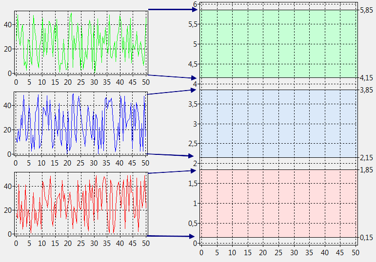
We can setup the graph coordinates in any convenient way. Suppose, the graph coordinates range from 0 to 6 (we could use any other numbers, but these are easy to calculate with). Then we can have the effect of three separate panes by assigning the first y axis to the lower third, the second y axis to the middle third, and the third y axis to the upper third of the entire range. Therefore, the first series will be plotted in the lower third of the chart since it is linked to the first y axis, etc.
In practice, add three ChartAxisTransformations to the form. Double-click on each (or find the property List in the Object Inspector of the ChartAxisTransform) and bring up the "Axis Transformations Editor". Click "Add" to create a Transformation and choose "Autoscale"). This adds an AutoScaleAxisTransform to each ChartAxisTransformations component. Select each AutoScaleAxisTransform and enter the following numbers for the properties MaxValue and MinValue which define the range for the axis transform:
ChartAxisTransformations1AutoScaleAxisTransform1: MaxValue 1.85 and MinValue 0.15
ChartAxisTransformations1AutoScaleAxisTransform2: MaxValue 3.85 and MinValue 2.15
ChartAxisTransformations1AutoScaleAxisTransform3: MaxValue 5.85 and MinValue 4.15
Note that these numbers are offset by 0.15 from the thirds discussed above (0 to 2, 2 to 4, and 4 to 6). This produces a little gap between the panes and makes the chart more pleasant.
The entire mapping procedure is sketched in the next diagram:
Bring up the Object Inspector for the chart, choose the AxisList property to get the AxisList Editor
and connect each left axis to the corresponding transformation. This is done by editing the "transformations" property of each y axis:
- 0 - Left:
Transformations = 'ChartAxisTransformations1' - 2 - Left:
Transformations = 'ChartAxisTransformations2' - 3 - Left:
Transformations = 'ChartAxisTransformations3'
To get the correct spacing at the top and at the bottom of the chart we must let the y axis extends match our chosen graph coordinates range of 0 to 6. Go to the Chart properties and edit the these extent settings:
Extent.YMax: 6Extent.YMin: 0Extent.UseYMax: trueExtent.UseYMin: true
Adding axis titles
Finally we add titles to the axis. In the Object Inspector set the following properties of each axis:
- 0 - Left:
Title.Caption = 'bottom y axis' - 1 - Bottom:
Title.Caption = 'x axis' - 2 - Left:
Title.Caption = 'center y axis' - 3 - Left:
Title.Caption = 'top y axis'
Set the property Visible of each axis title to true to show the titles. However, you'll notice two issues:
- The titles of the manually created y axes are not rotated by 90 degress. To fix this, go to the
Font.Orientationproperty of theTitleproperties of these axes and enter the value900. This is the rotation angle in tenths of degrees. - All y axes are drawn in the center of the vertical chart extent and, therefore, overlap. It would be better if each title would be drawn within the range of the corresponding axis. To fix this set the property
PositionOnMarksof theTitleof each axis to true.
Result
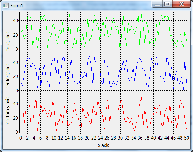
Now your application should look like this:
Source code
Project file
program panes_demo;

{$mode objfpc}{$H+}

uses
  {$IFDEF UNIX}{$IFDEF UseCThreads}
  cthreads,
  {$ENDIF}{$ENDIF}
  Interfaces, // this includes the LCL widgetset
  Forms, Unit1, tachartlazaruspkg
  { you can add units after this };

{$R *.res}

begin
  Application.Title := 'TAChart panes demo';
  RequireDerivedFormResource := True;
  Application.Initialize;
  Application.CreateForm(TForm1, Form1);
  Application.Run;
end.
Unit1.pas
unit Unit1;

{$mode objfpc}{$H+}

interface

uses
  Classes, SysUtils, Forms, Controls, Graphics, Dialogs,
  TAGraph, TASeries, TASources, TATransformations;

type

  { TForm1 }

  TForm1 = class(TForm)
    Chart1: TChart;
    Chart1LineSeries1: TLineSeries;
    Chart1LineSeries2: TLineSeries;
    Chart1LineSeries3: TLineSeries;
    ChartAxisTransformations1: TChartAxisTransformations;
    ChartAxisTransformations1AutoScaleAxisTransform1: TAutoScaleAxisTransform;
    ChartAxisTransformations2: TChartAxisTransformations;
    ChartAxisTransformations2AutoScaleAxisTransform1: TAutoScaleAxisTransform;
    ChartAxisTransformations3: TChartAxisTransformations;
    ChartAxisTransformations3AutoScaleAxisTransform1: TAutoScaleAxisTransform;
    RandomChartSource1: TRandomChartSource;
    RandomChartSource2: TRandomChartSource;
    RandomChartSource3: TRandomChartSource;
  end;

var
  Form1: TForm1;

implementation

{$R *.lfm}

end.
Unit1.lfm
object Form1: TForm1
  Left = 425
  Height = 454
  Top = 249
  Width = 616
  Caption = 'Form1'
  ClientHeight = 454
  ClientWidth = 616
  LCLVersion = '1.1'
  object Chart1: TChart
    Left = 0
    Height = 454
    Top = 0
    Width = 616
    AxisList = <
      item
        Group = 1
        Marks.Range.Max = 50
        Marks.Range.UseMax = True
        Marks.Range.UseMin = True
        Minors = <>
        Range.Max = 50
        Range.UseMax = True
        Range.UseMin = True
        Title.LabelFont.Orientation = 900
        Title.Visible = True
        Title.Caption = 'bottom y axis'
        Title.PositionOnMarks = True
        Transformations = ChartAxisTransformations1
      end
      item
        Alignment = calBottom
        Minors = <>
        Title.Visible = True
        Title.Caption = 'x axis'
      end
      item
        Group = 1
        Marks.Range.Max = 50
        Marks.Range.UseMax = True
        Marks.Range.UseMin = True
        Minors = <>
        Range.Max = 50
        Range.UseMax = True
        Range.UseMin = True
        Title.LabelFont.Orientation = 900
        Title.Visible = True
        Title.Caption = 'center y axis'
        Title.PositionOnMarks = True
        Transformations = ChartAxisTransformations2
      end
      item
        Group = 1
        Marks.Range.Max = 50
        Marks.Range.UseMax = True
        Marks.Range.UseMin = True
        Minors = <>
        Range.Max = 50
        Range.UseMax = True
        Range.UseMin = True
        Title.Margins.Bottom = 4
        Title.LabelFont.Orientation = 900
        Title.Visible = True
        Title.Caption = 'top y axis'
        Title.PositionOnMarks = True
        Transformations = ChartAxisTransformations3
      end>
   Extent.UseYMax = True
   Extent.UseYMin = True
   Extent.YMax = 6
   Foot.Brush.Color = clBtnFace
    Foot.Font.Color = clBlue
    Title.Brush.Color = clBtnFace
    Title.Font.Color = clBlue
    Title.Text.Strings = (
      'TAChart'
    )
    Align = alClient
    ParentColor = False
    object Chart1LineSeries1: TLineSeries
      AxisIndexY = 0
      LinePen.Color = clRed
      Source = RandomChartSource1
    end
    object Chart1LineSeries2: TLineSeries
      AxisIndexY = 2
      LinePen.Color = clBlue
      Source = RandomChartSource2
    end
    object Chart1LineSeries3: TLineSeries
      AxisIndexY = 3
      LinePen.Color = clLime
      Source = RandomChartSource3
    end
  end
  object RandomChartSource1: TRandomChartSource
    PointsNumber = 100
    RandSeed = 1497444274
    XMax = 50
    XMin = 0
    YMax = 50
    YMin = 0
    left = 122
    top = 46
  end
  object RandomChartSource2: TRandomChartSource
    PointsNumber = 100
    RandSeed = 1497485782
    XMax = 50
    XMin = 0
    YMax = 50
    YMin = 0
    left = 123
    top = 123
  end
  object RandomChartSource3: TRandomChartSource
    PointsNumber = 100
    RandSeed = 1497547025
    XMax = 50
    XMin = 0
    YMax = 50
    YMin = 0
    left = 122
    top = 208
  end
  object ChartAxisTransformations1: TChartAxisTransformations
    left = 369
    top = 46
    object ChartAxisTransformations1AutoScaleAxisTransform1: TAutoScaleAxisTransform
      MaxValue = 1.85
      MinValue = 0.15
    end
  end
  object ChartAxisTransformations2: TChartAxisTransformations
    left = 370
    top = 123
    object ChartAxisTransformations2AutoScaleAxisTransform1: TAutoScaleAxisTransform
      MaxValue = 3.85
      MinValue = 2.15
    end
  end
  object ChartAxisTransformations3: TChartAxisTransformations
    left = 365
    top = 208
    object ChartAxisTransformations3AutoScaleAxisTransform1: TAutoScaleAxisTransform
      MaxValue = 5.85
      MinValue = 4.15
    end
  end
end

