TAChart Tutorial: Dual y axis, Legend
│
English (en) │
suomi (fi) │
Introduction
When different quantities are plotted into the same chart it happens quite often that they cover a largely different range. In an "ordinary" chart, the series with the large values dominates over the series with the small values which is compressed to a flat line. The chart would be much more meaningful if different axes could be used, one for the large values, and one for the small values.
When you worked through the tutorial on user-defined chartsource you will have come across such a case. In that tutorial we created a diagram of the world population as a function of age. There was also an option to draw the ratio of male-to-female population. This latter number is considerably smaller than the population count. So, if both data were combined in the same chart, the population ratio would shrink to a horizontal line.
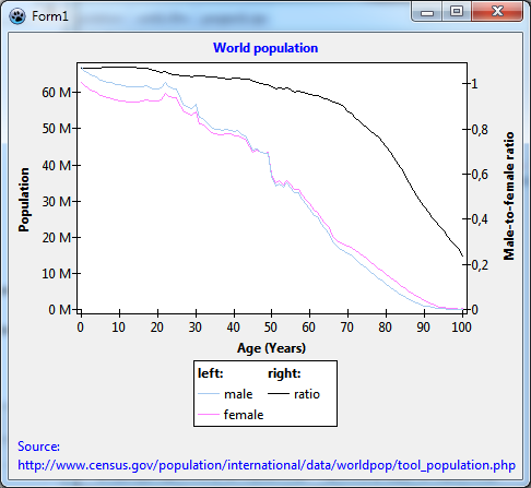
This is the background for today's project. We will go to the population data again and draw population count and the male-to-female ratio into the same chart.
You will learn how to
- create a chart with two y axes
- work with auto-scale axis transforms
- use user-defined axis labels
- tweak the legend using less-known properties.
This is our "disclaimer", as usual: You should be familiar with Lazarus and FPC, and you should have a basic understanding of the TAChart library (go through Getting started tutorial if you don't). In this particular tutorial, it would also be helpful if you had studied the tutorial on user-defined chartsource first.
Data
As already mentioned we will be using the same data as in the user-defined chartsource tutorial. The primary data file is called "population.txt" and originates from www.census.gov. Copy this file from the user-defined chartsource tutorial to your project output directory, or follow the instructions there on how to download the file. Unit population.pas reads this file and stores the data in an array of TPopulationRecords:
type
  TPopulationRecord = record
    Age: Integer;
    Total: Double;
    Male: Double;
    Female: Double;
    Ratio: Double;
  end;

  TPopulationArray = array of TPopulationRecord;
Now, we have all that we need to start a new project. Add the unit population.pas to the form's uses list. Add a variable PopulationData of type TPopulationArray to the private section of the form. And read the data file by calling the procedure LoadPopulationData (in the population unit) from the form's OnCreate event handler:
uses
  ..., population, ...;

type
  TForm1 = class(TForm)
  // ...
  private
    PopulationData : TPopulationArray;
  // ...
  end;

const
  POPULATION_FILE = 'population.txt';

procedure TForm1.FormCreate(Sender: TObject);
begin
  LoadPopulationData(POPULATION_FILE, PopulationData);
end;
Preparation of the chart
Now we can begin charting...
Add a TChart component to the form:
- Align it as
alClient. - Set its
BackColortoclWhite.
Add three line series to the chart:
- To be more descriptive, change their names to
LineSeries_male,LineSeries_female, andLineSeries_ratio. - Set the
SeriesColorof the male series to a "boyish"clSkyBlue, that of the female series to a "girlish"$00FF80FF, and leave the color of the ratio series at black.
Where do the series get their data from? Our data is stored in the PopulationData array, so it would be best to take advantage of a user-defined chart source. To be exact: we need three chart sources, one for each series.
Therefore, let's add three TUserDefinedChartSources to the form:
- Rename them as
ChartSource_male,ChartSource_female, andChartSource_ratio. - Assign each chartsource to the property
Sourceof the corresponding line series. - Write the following event handler and assign it to the
OnGetDataItemevent of each user-defined chart source:
procedure TForm1.ChartSourceGetChartDataItem(
  ASource: TUserDefinedChartSource; AIndex: Integer; var AItem: TChartDataItem);
begin
  AItem.X := PopulationData[AIndex].Age;
  if ASource = ChartSource_male then
    AItem.Y := PopulationData[AIndex].Male / 1e6
  else if ASource = ChartSource_female then
    AItem.Y := PopulationData[AIndex].Female / 1e6
  else
    AItem.Y := PopulationData[AIndex].Ratio / 100;
end;
Here we tell the chart source where it finds the data: the x value is taken from the Age field of the TPopulationRecord, and, depending on the chart source, the y value is taken from the Male, Female or Ratio fields of the TPopulationRecord.
We divide the population count by 1 million to get rid of many zeros. So, don't forget: the population axis will be labelled in terms of millions; we will come back to that later. We also divide the male-to-female ratio, as read from the file, by 100 since we just want fractions, no percentages.
Time to compile? No, not yet. We have to tell the chart sources the number of data points. This information is known after reading the data file. Therefore, we set the property PointNumber of each chart source to the length of the data array in the form's OnCreate event handler:
procedure TForm1.FormCreate(Sender: TObject);
begin
  LoadPopulationData(POPULATION_FILE, PopulationData);
  ChartSource_male.PointsNumber := Length(PopulationData);
  ChartSource_female.PointsNumber := Length(PopulationData);
  ChartSource_ratio.PointsNumber := Length(PopulationData);
end;
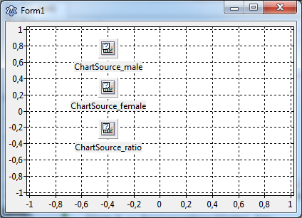
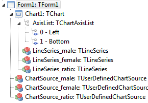
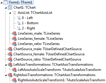
At this stage, your form and object tree should look like this:
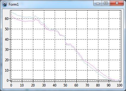
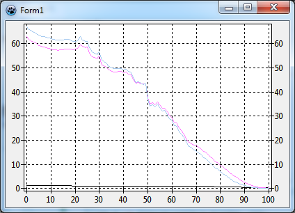
and when you compile and run you should see something like this:
As mentioned in the introduction, the male-to-female ratio -- that is the black line -- is very flat and shows almost no structure. This is due to the different magnitudes: the population numbers go almost up to 70 while the ratio is around 1.
Setting up a second y axis
We need a second y axis.
For this, go to the object tree, right-click on AxisList (right underneath the Chart1) and add a new axis to the chart. Now we have three axes:
Select the axis #2 which is still a left axis at this time, and in the object inspector, set its Alignment to calRight.
This is maybe a good place to mention that having two y axes is not the limit. In fact, you can add any number of axes to the AxisList of the chart, and you can use them as vertical axes at the left or right, or as horizontal axes at the top or the bottom of the chart. Have a look at the parameter Group of the axis: axes with the same group parameter are drawn into the same rectangle, axes with different group values are drawn side-by-side.
How does the chart know which series belongs to which axis? For this purpose, each series has properties AxisIndexX and AxisIndexY. Since the male and female series will be plotted on the left axis set their AxisIndexY to 0 -- a look at the object tree tells you that this is the index of the left axis. The ratio series belongs to the right axis, its AxisIndexY must be set to 2. We could also set the axis indices for the bottom axis, but this is not absolutely necessary here.
When we compile the result is a bit disappointing: no change - the black ratio series is still very small.
Setting up auto-scale axis transformations
The reason why the second y axis is not scaled independently of the first one is that we ignore so far internal coordinate systems of the chart. TAChart employs three coordinate systems in the transition from "real world" data to the pixels on the screen:
- axis coordinates are the coordinates in which the data come in, or, in other words, which are labeled along the axes. In our project, these are e.g. the population numbers (after division by 1 million), i.e. numbers between about 0 and 70.
- graph coordinates are obtained after applying transformations. There is another tutorial where we apply a logarithmic transform, in this case the graph coordinates would be the logarithms of the input data.
- image coordinates belong to the pixels on the screen calculated from the graph coordinates.
So, there are two mapping operations involved when calculating the coordinates of a data point on the screen:
- axis coordinates to screen coordinates by means of a user-specified
TChartAxisTransform - screen coordinates to image coordinates by means of simple linear mapping
If the axis transformation from axis to graph coordinates is not specified a simple 1:1 mapping is used instead.
Oh -- we did not use any axis transform. Therefore, our population and ratio data still "live" in a common world of coordinates. To separate both data sets we need to apply a transformation to each data set which maps it to the same interval of graph coordinates, say, from 0 to 1.
For this purpose, TAChart has TAutoScaleAxisTransform. It is not directly accessible from the component palette, but is a child of the TChartAxisTransformations component.
So, let's drop two TChartAxisTransformations on the form, one for the left axis, one for the right axis. Rename them to LeftAxisTransformations and RightAxisTransformations, respectively. Double-click on each of these components and select "auto scale" from the axis transformations editor. In the object tree, you will see a child of each ChartAxisTransformations component. Rename these children to LeftAxisAutoscaleTransform and RightAxisAutoscaleTransform, respectively. Now assign the LeftAxisTransformations and RightAxisTransformations components to the property Transformations of the left and the right axis.
This is the object tree after these operations:
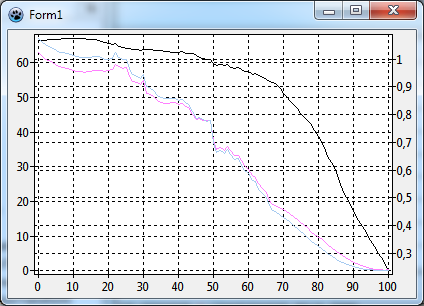
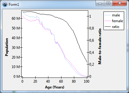
Look at the properties MaxValue and MinValue of the AutoScaleAxisTransforms. For both transformations we have MaxValue = 1 and MinValue = 0. This means that each axis is mapped to the range between 0 and 1, in other words, both data sets are compressed or expanded to fill the chart area completely.
When we compile we see that this exactly happens.
We could also, for example, set the RightAxisAutoscaleTransform's MinValue=1 and MaxValue=2. Then the population data would still be mapped on the axis from 0 to 1, and the male-to-female ratio data would be mapped to the range from 1 to 2, i.e. we would have a paned chart where the lower half would be occupied by the population series and the upper half by the ratio series. But maybe that's stuff for another tutorial. We leave the MinValue and MaxValue properties at their defaults.
Cleaning up
The most difficult part is done now. What is left is to clean up the chart.
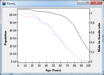
- Remove the grids from the axes (you should know how to do that...). The left and right axis grids, in particular, are very confusing.
- Add axis titles:
- "Population" on the left axis
- "Male-to-female ratio" on the right axis
- "Age (Years)" on the bottom axis.
- Set the axes'
LabelFont.StyletofsBold.
- You will notice that the title of the right axis is not rotated. The
Title.LabelFontof the axis has a propertyOrientation- this is the rotation angle in tenth's of degrees. Set it to 900 to get the same orientation as the title of the left axis. - Force the right axis to start at zero by setting its
Range.UseMinto true. This is sufficient since theRange.XMinis at 0 by default. In this way, you could also select other ranges for the axes.
Modifying the axis tick mark texts
Now we should take care of the fact that we had divided that input data by 1E6, our plot somehow should show this. We could change the title of the left axis to "Population (in millions)". But let's go a different way now: we could append an "M" to the labels, as a shortcut to the correct order of magnitude ("M" = "Mega" = "million"). There are two ways to achieve this: In the first one, we use the property Marks.Format of the axis where the "M" can be added ('%0:.9g M'). Or in the second way, we can take advantage of the event OnMarkToText that TChartAxis has; this event allows to modify the text displayed at the axis' tick marks in any way. In this case, assign the following procedure to this event of the left axis:
procedure TForm1.Chart1AxisList0MarkToText(var AText: String; AMark: Double);
begin
  AText := Format('%s M', [AText]);
end;
Setting up the legend
We are almost finished now. What is left is a legend -- so far, it is not possible for the user to distinguish which curve belongs to which data. So, go to Chart1.Legend and set Visible to true. You see only short pieces of the curves in the legend, no texts. This is because we did not assign a Title to each series. Do this now, use the titles "male", "female", and "ratio" for the corresponding series.
Since we have two axes, it would be fine to have a header "left" above the entries for the male and female series in the legend, and a header "right" above the entry for the ratio series.
This effect can be achieved by grouping. Each series has a property Legend which can be used to control the appearance of the series in the legend. The property GroupIndex allows to group a set of series together underneath a common header. So, set the Legend.GroupIndex of the male and female series to zero, and set that of the ratio series to 1. Now we go the Chart.Legend and define the titles of the group headers by entering text in the property Chart.Legend.GroupTitles, line by line for each GroupIndex. And maybe you can also go to Chart.Legend.GroupFont and set the font to bold.
A final improvement: what about if the legend were underneath the chart such that the items belonging to the left axis were on the left, and those belonging to the right axis were on the right?
At first, we set the legend's Alignment to laBottomCenter. Then we change the ColumnCount to 2. We are lucky -- the five legend entries fit into the two-column legend just as we want it. Otherwise we might have to play with the legend Order or the filling sequence of the multicolumn legend (property ItemFillOrder), or might have to introduce (dummy items).
TAChart's legend is very flexible -- please have a look at the documentation to learn more about it.
At the end, we add the text "World population" as the chart's title, and we should mention our reference for the data in the footer -- we don't want to steal data...
Finished!
Source code
Project file
For Lazarus v2.1+ you can find the source code of this tutorial project in folder components/tachart/tutorials/population2 of your Lazarus installation. For older versions, copy and paste the following code to the corresponding files.
program project1;

{$mode objfpc}{$H+}

uses
  {$IFDEF UNIX}{$IFDEF UseCThreads}
  cthreads,
  {$ENDIF}{$ENDIF}
  Interfaces, // this includes the LCL widgetset
  Forms, Unit1, tachartlazaruspkg
  { you can add units after this };

{$R *.res}

begin
  RequireDerivedFormResource := True;
  Application.Initialize;
  Application.CreateForm(TForm1, Form1);
  Application.Run;
end.
Unit1.pas
unit Unit1;

{$mode objfpc}{$H+}

interface

uses
  Classes, SysUtils, FileUtil, TAGraph, TASeries, TASources, Forms, Controls,
  Graphics, Dialogs, population, TACustomSource, TATransformations, TAChartAxisUtils;

type

  { TForm1 }

  TForm1 = class(TForm)
    Chart1: TChart;
    LeftAxisTransformations: TChartAxisTransformations;
    LeftAxisAutoScaleTransform: TAutoScaleAxisTransform;
    RightAxisTransformations: TChartAxisTransformations;
    LineSeries_male: TLineSeries;
    LineSeries_female: TLineSeries;
    LineSeries_ratio: TLineSeries;
    ChartSource_male: TUserDefinedChartSource;
    ChartSource_female: TUserDefinedChartSource;
    ChartSource_ratio: TUserDefinedChartSource;
    RightAxisAutoScaleTransform: TAutoScaleAxisTransform;
    procedure Chart1AxisList0MarkToText(var AText: String; AMark: Double);
    procedure ChartSourceGetChartDataItem(
      ASource: TUserDefinedChartSource; AIndex: Integer;
      var AItem: TChartDataItem);
    procedure FormCreate(Sender: TObject);
  private
    { private declarations }
    PopulationData: TPopulationArray;
  public
    { public declarations }
  end;

var
  Form1: TForm1;

implementation

{$R *.lfm}

const
  POPULATION_FILE = 'population.txt';

{ TForm1 }

procedure TForm1.ChartSourceGetChartDataItem(
  ASource: TUserDefinedChartSource; AIndex: Integer; var AItem: TChartDataItem);
begin
  AItem.X := PopulationData[AIndex].Age;
  if ASource = ChartSource_male then
    AItem.Y := PopulationData[AIndex].Male / 1e6
  else if ASource = ChartSource_female then
    AItem.Y := PopulationData[AIndex].Female / 1e6
  else
    AItem.Y := PopulationData[AIndex].Ratio / 100;
end;

procedure TForm1.Chart1AxisList0MarkToText(var AText: String; AMark: Double);
begin
  AText := Format('%s M', [AText]);
end;

procedure TForm1.FormCreate(Sender: TObject);
begin
  LoadPopulationData(POPULATION_FILE, PopulationData);
  ChartSource_male.PointsNumber := Length(PopulationData);
  ChartSource_female.PointsNumber := Length(PopulationData);
  ChartSource_ratio.PointsNumber := Length(PopulationData);
end;

end.
Unit1.lfm
object Form1: TForm1
  Left = 365
  Height = 409
  Top = 169
  Width = 470
  Caption = 'Form1'
  ClientHeight = 409
  ClientWidth = 470
  OnCreate = FormCreate
  LCLVersion = '1.1'
  object Chart1: TChart
    Left = 0
    Height = 409
    Top = 0
    Width = 470
    AxisList = <
      item
        Grid.Visible = False
        Minors = <>
        Title.LabelFont.Orientation = 900
        Title.LabelFont.Style = [fsBold]
        Title.Visible = True
        Title.Caption = 'Population'
        Transformations = LeftAxisTransformations
        OnMarkToText = Chart1AxisList0MarkToText
      end
      item
        Grid.Visible = False
        Alignment = calBottom
        Minors = <>
        Title.LabelFont.Style = [fsBold]
        Title.Visible = True
        Title.Caption = 'Age (Years)'
      end
      item
        Grid.Visible = False
        Alignment = calRight
        Minors = <>
        Range.UseMin = True
        Title.LabelFont.Orientation = 900
        Title.LabelFont.Style = [fsBold]
        Title.Visible = True
        Title.Caption = 'Male-to-female ratio'
        Transformations = RightAxisTransformations
      end>
    BackColor = clWhite
    Foot.Alignment = taLeftJustify
    Foot.Brush.Color = clBtnFace
    Foot.Font.Color = clBlue
    Foot.Text.Strings = (
      'Source:'
      'http://www.census.gov/population/international/data/worldpop/tool_population.php'
    )
    Foot.Visible = True
    Legend.Alignment = laBottomCenter
    Legend.ColumnCount = 2
    Legend.GroupFont.Style = [fsBold]
    Legend.GroupTitles.Strings = (
      'left:'
      'right:'
    )
    Legend.Visible = True
    Title.Brush.Color = clBtnFace
    Title.Font.Color = clBlue
    Title.Font.Style = [fsBold]
    Title.Text.Strings = (
      'World population'
    )
    Title.Visible = True
    Align = alClient
    ParentColor = False
    object LineSeries_male: TLineSeries
      Legend.GroupIndex = 0
      Title = 'male'
      AxisIndexY = 0
      LinePen.Color = clSkyBlue
      Source = ChartSource_male
    end
    object LineSeries_female: TLineSeries
      Legend.GroupIndex = 0
      Title = 'female'
      AxisIndexY = 0
      LinePen.Color = 16744703
      Source = ChartSource_female
    end
    object LineSeries_ratio: TLineSeries
      Legend.GroupIndex = 1
      Title = 'ratio'
      AxisIndexY = 2
      Source = ChartSource_ratio
    end
  end
  object ChartSource_male: TUserDefinedChartSource
    OnGetChartDataItem = ChartSourceGetChartDataItem
    left = 130
    top = 25
  end
  object ChartSource_female: TUserDefinedChartSource
    OnGetChartDataItem = ChartSourceGetChartDataItem
    left = 130
    top = 79
  end
  object ChartSource_ratio: TUserDefinedChartSource
    OnGetChartDataItem = ChartSourceGetChartDataItem
    left = 130
    top = 137
  end
  object LeftAxisTransformations: TChartAxisTransformations
    left = 267
    top = 25
    object LeftAxisAutoScaleTransform: TAutoScaleAxisTransform
    end
  end
  object RightAxisTransformations: TChartAxisTransformations
    left = 267
    top = 136
    object RightAxisAutoScaleTransform: TAutoScaleAxisTransform
    end
  end
end
population.pas
unit population;

{$mode objfpc}{$H+}

interface

uses
  Classes, SysUtils;

type
  TPopulationRecord = record
    Age: Integer;
    Total: Double;
    Male: Double;
    Female: Double;
    Ratio: Double;
  end;
  TPopulationArray = array of TPopulationRecord;

procedure LoadPopulationData(const AFileName: String; var AData: TPopulationArray);

implementation

procedure LoadPopulationData(const AFileName: String; var AData: TPopulationArray);

  function StripThousandSep(const s: String): String;
  // Removes the thousand separators from the string
  // Otherwise StrToFloat would fail.
  var
    i: Integer;
  begin
    Result := s;
    for i:=Length(Result) downto 1 do
      if Result[i] = ',' then
        Delete(Result, i, 1);
  end;

var
  List1, List2: TStringList;
  i, j, n: Integer;
  s: String;
  ds: char;
begin
  ds := FormatSettings.DecimalSeparator;
  List1 := TStringList.Create;
  try
    List1.LoadFromFile(AFileName);
    n := List1.Count;
    SetLength(AData, n-2);
    FormatSettings.DecimalSeparator := '.';
    List2 := TStringList.Create;
    try
      List2.Delimiter := #9;
      List2.StrictDelimiter := true;
      j := 0;
      for i:=2 to n-1 do begin
        List2.DelimitedText := List1[i];
        s := List1[i];
        with AData[j] do begin
          if i < n-1 then
            Age := StrToInt(trim(List2[0]))
          else
            Age := 100;  // the last line is "100 +"
          Total := StrToFloat(StripThousandSep(trim(List2[1])));
          Male := StrToFloat(StripThousandSep(trim(List2[2])));
          Female := StrToFloat(StripThousandSep(trim(List2[3])));
          Ratio := StrToFloat(trim(List2[4]));
        end;
        inc(j);
      end;
    finally
      List2.Free;
    end;
  finally
    FormatSettings.DecimalSeparator := ds;
    List1.Free;
  end;
end;

end.
