TAChart Tutorial: BarSeries
│
Deutsch (de) │
English (en) │
suomi (fi) │
русский (ru) │
Introduction
The TAChart library can create a variety of charts in Lazarus. But in comparison with other series types, bar series appear to be more difficult, mostly because there is a wide range of possibilities:
- side-by-side bar series
- stacked bar series
- stacked bar series normalized to 100%
- vertical bar series
- horizontal bar series
In this tutorial we want to show you the basic idea of how to create a chart with several bar series arranged in a side-by-side manner. A follow-up tutorial will teach you how to stack bars above each other.
Besides bar series this tutorial will also introduce TRandomChartSource which is a convenient data source to design and test a chart without needing to compile the application.
You'll need some basic knowledge of Pascal and Lazarus. Have a look at the TAChart Tutorial: Getting started to learn some basic skills for working with TAChart if this library is new to you. We also recommend to study the TAChart documentation.
Preparation
Setting up the chart
Create a new project, save it.
Add a TChart component from Lazarus' component palette to Form1, scale it to fill a given region of the form.
Data for plotting
Before continuing let's think about which data we want to plot. Maybe you could use the balance of your checking and saving accounts, or the business results of large companies found somewhere in the internet, or something completely different...
Let's go a different way this time: why don't we plot just random data? Of course, they don't mean anything, but they are simple and very convenient for exercising. In particular, TAChart contains the TRandomChartSource component which provides random data to be plugged into a series seamlessly at design-time. This means you can follow this tutorial without a need to write a line of code and without a need to compile the demo application. Later, when the layout work is done, you could remove the RandomChartSources and replace them with the ChartSources containing our data.
As you will see shortly, there will be three series in the chart, each of them with - say - four bars. For each series, you'll need a RandomChartSource. To add a RandomChartSource have a look at the "Chart" component palette - it is the fourth icon in the palette highlighted by red in the screenshot below:
Add three RandomChartSources to the form - one per series. Rename them as RedChartSource, BlueChartSource, and YellowChartSource since they will be linked to "red", "blue" and "yellow" bar series to be created immediately (you should always prefer to use "speaking" variable names.)
Before doing so, we need to set up the RandomChartSources because they do not provide any data by default. We want to have four bars per series. Therefore, set the property PointsNumber to 4. In order to get the axis labels in sync with the bars the x axis must range between 1 and 4 (or between 0 and 3, or between 0 and 39, whatever you like - we'll come across axis labels later in more details): XMin = 1, XMax = 4. And finally we also have to specify the y axis range, maybe select YMin = 0 and YMax = 100.
Bar series
Adding series
Now that all preparations are done we can add the bar series to the chart. Double-click on the chart to open the series editor. Click "Add" and select "Bar series" from the list. Repeat twice. In the end, we have three bar series in the chart. We don't see them in the chart since they are not yet linked to our data. In the object tree of the Object Inspector, however, the series appear as children of the Chart node.
Click at the first series in the object tree, and - in the Object Inspector - go to the property Source and pick RedChartSource from the list. Now the series becomes visible in the chart. To make it "red" go to its property SeriesColor and select the color clRed. Rename the series to "RedBarSeries", and change its title to "red". The latter is for the legend which we turn on by setting the chart's Legend.Visible to true.
Repeat with the other two series correspondingly.
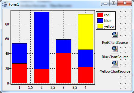
Now the chart displays the bar series. However, the bars are located at the same value of the x axis, the yellow bars are partly covered by the other bars. Let's fix this.
Side-by-side arrangement of bars
In oder to arrange the bars of each group (i.e. bars corresponding to the same x value) side-by-side, we have to shift them horizontally. TBarSeries offers two properties for this purpose:
BarWidthPercentBarOffsetPercent
Both numbers are expressed as a percentage of the distance to the next bar group. (In some charts, the bars are not equidistant and therefore get varying bar widths. To achieve a constant bar thickness in such a case, set the property BarWidthStyle to bwPercentMin.)
The basic idea is that the space between the bar groups (100%) is divided by the bars and some empty space to the next group. If we want to leave a gap of - say - one bar width between the groups, we have to divide 100% by 4 (3 bars plus gap), i.e. each bar can occupy a width of 25%.
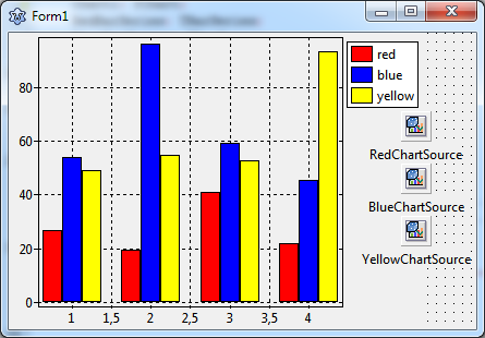
So, let's set the BarWidthPercent to 25% and see what happens. Oh - not quite what we wanted: The bars did get narrower, but they are still overlapping. Of course, this happens because we did not change the BarOffsetPercent parameter.
Currently, BarOffsetPercent is zero which means that the center of each bar is exactly at the position of the axis tick mark. We have to shift the red bars to the left and the yellow bars to the right such that they touch the blue bars which remain in the center. The shift difference is one bar width, i.e. 25%. For moving the red bars to the left their BarOffsetPercent has to be negative.
In summary, we use the following values:
RedBarSeries: BarOffsetPercent = -25, BarWidthPercent = 25BlueBarSeries: BarOffsetPercent = 0, BarWidthPercent = 25YellowBarSeries: BarOffsetPercent = 25, BarWidthPercent = 25
Axis
Using text labels
The next issue to be addressed is the x axis. Usually bar charts are considered to display categories of some data sets which often requires text labels underneath each bar group. But so far, we only have numerical labels, and the intermediate labels at half integers are particularly annoying.
The best way to get this right is to use an additional ChartSource for assigning the strings to the axis values, it is a TListChartSource this time to be found as the second icon in the chart component palette. Add it to the form and rename is as LabelsChartSource.
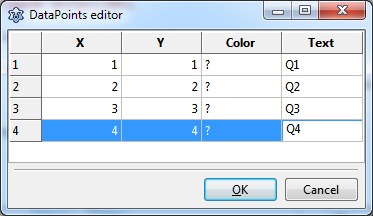
The ListChartSource has a built-in data editor which allows to enter data at design-time. Select the LabelsChartSource and go to the property DataPoints. Click on "..." at the right to open the data points editor, and enter the following data:
In the "X" column we enter the values of the x coordinates of each bar group. We could omit the "Y" column, but as we'll see later that it is conventient to have the same data in this column as well because labels are retained after rotation of the bars to an horizontal arrangement. In the column "Text" we specify the texts that will appear for each bar group along the axis as axis marks. Let us assume that our data represent some seasonal values and use the abbreviations "Q1", "Q2", "Q3", and "Q4" for "quarter 1" etc. Column "Color" can be left empty.
In order to activate these labels we have to assign this ChartSource to the Source property of the Marks of the bottom axis, and we have to set the property Style of the Marks to smsLabel.
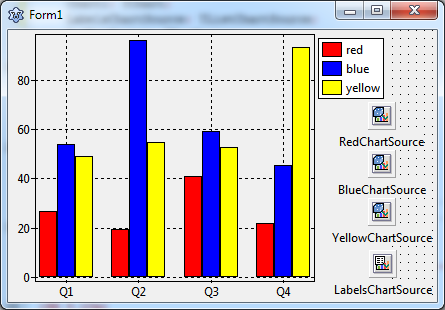
Voila - here's what we get:
Showing grid lines & ticks between groups
A minor issue can be improved: the chart would be clearer if the axis tick marks and grid lines were not at the center of the bar groups, but right between them.
At first, we turn off the grid of the bottom axis: BottomAxis.Grid.Visible = false. To remove the ticks, we can set the TickLength and the TickInnerLength to 0.
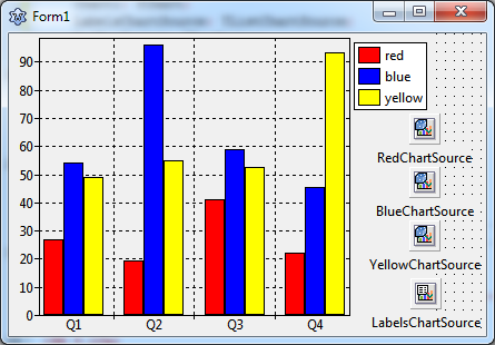
But how to add grid lines between the chart groups? This can be done by creating a "minor" axis to the bottom axis. This is another set of ticks and gridlines in addition to the "major" axis. Go to the bottom axis and click on Minors to open the corresponding editor. Click "Add" and the select the 0 - M in the list. Back in the normal Object Inspector, activate Visible, increase the TickLength to 4, and finally, set Intervals.Count to 1 - we only want one minor tick between the major ticks. Check the Grid settings - Visible should be true.
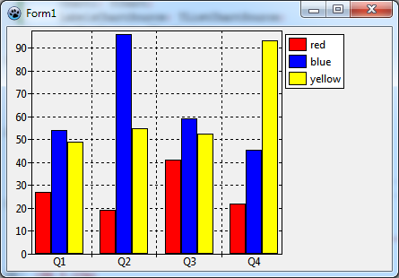
This leads to the final result. Final? Not quite! There is an annoying little gap underneath the bars. This originates from the chart's Margins property which leaves some distance between the series and the axes. Just set Chart.Margins.Bottom to 0 to remove the gap.
Horizontal bar series
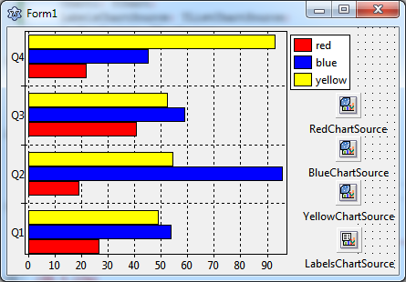
Before closing this lesson we'd like to quickly modify this project and create a plot with horizontal bars. This kind of diagram is often preferred when the axis labels consist of lengthy texts, and the chart is in a landscape orientation.
TAChart does not offer a dedicated "THorizontalBarSeries", but the standard TBarSeries can easily be modified to obtain horizontal bars. Like any other descendant of TChartSeries it has properties AxisIndexX and AxisIndexY to indicate which axis is responsible for x and y coordinates. Just set AxisIndexX to the index of the LeftAxis (usually 0) and AxisIndexY to that of the BottomAxis in order to rotate the bar direction.
And, of course, the LabelsChartSource has to be linked to the Marks.Source of the LeftAxis this time. And the minor axis has to be handled accordingly.
Essentially, that's all that's needed to create a chart with horizontal bars.
Summary
Steps to create a side-by-side bar chart:
- Every bar requires a separate BarSeries.
- Use the BarSeries' properties
BarWidthPercentandBarOffsetPercentto arrange the bars side-by-side with or without overlapping. The percentages refer to the distance between the center of the bar groups. - For horizontal bar series, set the series'
AxisIndexXto the index of the chart'sLeftAxis(usually0) andAxisIndexYto the index of theBottomAxis(usually1).
Source code
The source code of this tutorial is available in the folder components/tachart/tutorials/bar_series of your TAChart installation of newer Lazarus versions.
Project file
program project1;

{$mode objfpc}{$H+}

uses
  {$IFDEF UNIX}{$IFDEF UseCThreads}
  cthreads,
  {$ENDIF}{$ENDIF}
  Interfaces, // this includes the LCL widgetset
  Forms, tachartlazaruspkg, Unit1
  { you can add units after this };

{$R *.res}

begin
  RequireDerivedFormResource := True;
  Application.Initialize;
  Application.CreateForm(TForm1, Form1);
  Application.Run;
end.
Unit1.pas
unit Unit1;

{$mode objfpc}{$H+}

interface

uses
  Classes, SysUtils, FileUtil, Forms, Controls, Graphics, Dialogs, TAGraph,
  TASeries, TASources;

type

  { TForm1 }

  TForm1 = class(TForm)
    Chart1: TChart;
    LabelsChartSource: TListChartSource;
    RedBarSeries: TBarSeries;
    BlueBarSeries: TBarSeries;
    YellowBarSeries: TBarSeries;
    RedChartSource: TRandomChartSource;
    BlueChartSource: TRandomChartSource;
    YellowChartSource: TRandomChartSource;
  private
    { private declarations }
  public
    { public declarations }
  end;

var
  Form1: TForm1;

implementation

{$R *.lfm}

end.
Unit1.lfm (vertical bars)
object Form1: TForm1
  Left = 381
  Height = 272
  Top = 444
  Width = 429
  Caption = 'Form1'
  ClientHeight = 272
  ClientWidth = 429
  LCLVersion = '1.3'
  object Chart1: TChart
    Left = 0
    Height = 272
    Top = 0
    Width = 384
    AxisList = <
      item
        Minors = <>
        Title.LabelFont.Orientation = 900
      end
      item
        Grid.Visible = False
        TickLength = 0
        Alignment = calBottom
        Marks.Format = '%2:s'
        Marks.Source = LabelsChartSource
        Marks.Style = smsLabel
        Minors = <
          item
            Intervals.Count = 1
            Intervals.MinLength = 5
            Intervals.Options = [aipUseCount, aipUseMinLength]
            TickLength = 4
          end>
      end>
    Foot.Brush.Color = clBtnFace
    Foot.Font.Color = clBlue
    Legend.Visible = True
    Margins.Bottom = 0
    Title.Brush.Color = clBtnFace
    Title.Font.Color = clBlue
    Title.Text.Strings = (
      'TAChart'
    )
    ParentColor = False
    object RedBarSeries: TBarSeries
      Title = 'red'
      BarBrush.Color = clRed
      BarOffsetPercent = -25
      BarWidthPercent = 25
      Source = RedChartSource
    end
    object BlueBarSeries: TBarSeries
      Title = 'blue'
      BarBrush.Color = clBlue
      BarWidthPercent = 25
      Source = BlueChartSource
    end
    object YellowBarSeries: TBarSeries
      Title = 'yellow'
      BarBrush.Color = clYellow
      BarOffsetPercent = 25
      BarWidthPercent = 25
      Source = YellowChartSource
    end
  end
  object RedChartSource: TRandomChartSource
    PointsNumber = 4
    RandSeed = 1
    XMax = 4
    XMin = 1
    YMax = 100
    YMin = 0
    left = 360
    top = 72
  end
  object BlueChartSource: TRandomChartSource
    PointsNumber = 4
    RandSeed = 2
    XMax = 4
    XMin = 1
    YMax = 100
    YMin = 0
    left = 360
    top = 120
  end
  object YellowChartSource: TRandomChartSource
    PointsNumber = 4
    RandSeed = 3
    XMax = 4
    XMin = 1
    YMax = 100
    YMin = 0
    left = 360
    top = 168
  end
  object LabelsChartSource: TListChartSource
    DataPoints.Strings = (
      '1|1|?|Q1'
      '2|2|?|Q2'
      '3|3|?|Q3'
      '4|4|?|Q4'
    )
    left = 361
    top = 220
  end
end
Unit1.lfm (horizontal bars)
object Form1: TForm1
  Left = 381
  Height = 272
  Top = 444
  Width = 429
  Caption = 'Form1'
  ClientHeight = 272
  ClientWidth = 429
  LCLVersion = '1.3'
  object Chart1: TChart
    Left = 0
    Height = 272
    Top = 0
    Width = 384
    AxisList = <
      item
        Grid.Visible = False
        TickLength = 0
        Marks.Format = '%2:s'
        Marks.Source = LabelsChartSource
        Marks.Style = smsLabel
        Minors = <
          item
            Intervals.Count = 1
            Intervals.MinLength = 5
            Intervals.Options = [aipUseCount, aipUseMinLength]
            TickLength = 4
          end>
        Title.LabelFont.Orientation = 900
      end
      item
        Alignment = calBottom
        Minors = <>
      end>
    Foot.Brush.Color = clBtnFace
    Foot.Font.Color = clBlue
    Legend.Visible = True
    Margins.Bottom = 0
    Title.Brush.Color = clBtnFace
    Title.Font.Color = clBlue
    Title.Text.Strings = (
      'TAChart'
    )
    ParentColor = False
    object RedBarSeries: TBarSeries
      Title = 'red'
      AxisIndexX = 0
      AxisIndexY = 1
      BarBrush.Color = clRed
      BarOffsetPercent = -25
      BarWidthPercent = 25
      Source = RedChartSource
    end
    object BlueBarSeries: TBarSeries
      Title = 'blue'
      AxisIndexX = 0
      AxisIndexY = 1
      BarBrush.Color = clBlue
      BarWidthPercent = 25
      Source = BlueChartSource
    end
    object YellowBarSeries: TBarSeries
      Title = 'yellow'
      AxisIndexX = 0
      AxisIndexY = 1
      BarBrush.Color = clYellow
      BarOffsetPercent = 25
      BarWidthPercent = 25
      Source = YellowChartSource
    end
  end
  object RedChartSource: TRandomChartSource
    PointsNumber = 4
    RandSeed = 1
    XMax = 4
    XMin = 1
    YMax = 100
    YMin = 0
    left = 360
    top = 72
  end
  object BlueChartSource: TRandomChartSource
    PointsNumber = 4
    RandSeed = 2
    XMax = 4
    XMin = 1
    YMax = 100
    YMin = 0
    left = 360
    top = 120
  end
  object YellowChartSource: TRandomChartSource
    PointsNumber = 4
    RandSeed = 3
    XMax = 4
    XMin = 1
    YMax = 100
    YMin = 0
    left = 360
    top = 168
  end
  object LabelsChartSource: TListChartSource
    DataPoints.Strings = (
      '1|1|?|Q1'
      '2|2|?|Q2'
      '3|3|?|Q3'
      '4|4|?|Q4'
    )
    left = 361
    top = 220
  end
end
