pas2js designtime
Designtime support for Pas2JS Components
The pas2jscomponents.lpk package that comes with lazarus installs design-time support for pas2js webwidgets and design-time editing of components.
Installed functionality
- there is a new file type 'HTML Fragment', this is akin to a 'Form' or 'Frame'.
- There are several components that allow you to interact with the HTML.
- THTMLElementActionList
- TBootstrapModal
- TBootstrapToastWidget
- TTemplateLoader
- TSQLDBRestConnection
- TSQLDBRestDataset
- TDBBootstraptableWidget
- TDBLoopTableWidget
- TDBSelectWidget
The package also installs support for parsing HTML files and loading HTML id attributes from the html. Properties that need a HTML element ID, will display a dropdown with the discovered ID attributes.
HTML Fragment
The HTML fragment is the HTML equivalent of a form in a native LCL application. An application can contain multiple HTML fragments, which can be shown at the same time or separately.
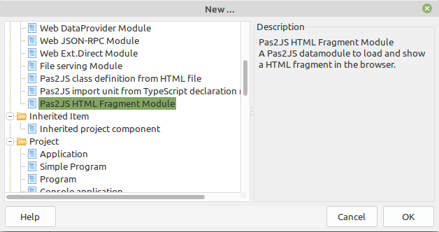
You can add a new HTML fragment with the File-New dialog:
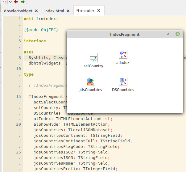
This will start a new form, which looks like a datamodule in the IDE.
After dropping some components on it, it will look for example like this in the designer:
The object inspector can be used to manipulate the properties, just as for a regular form.
   Note:
   You must add -JRjs to the custom compiler options of your project to include the form data in the application.
   Additionally, the p2jsres unit must be added to the uses clause of your program, so the resource data can be loaded when the program is run.
The HTML for the fragment can be loaded in 3 ways:
- Set the UseProjectHTMLFile property to True if you will only use the main html file of your project. No additional HTML will be loaded.
- Set the TemplateName property to the name of a template to load.
- Set the HTMLFilename property to the name of a HTML file to load. It will be loaded using the global template loader in unit rtl.TemplateLoader
The ParentID property determines under what HTML element in the main HTML page the HTML fragment will be loaded.
The following events exist:
- OnAllowUnrender is called when you wish to show another HTML fragment instead of this one. It is equivalent to OnCloseQuery in an LCL form.
- OnCreate Called when the fragment is created. note that the HTML is not yet available.
- OnDestroy Called when the fragment is destroyed.
- OnHTMLLoaded Called when the HTML fragment has been loaded from the server.
- OnRendered Called when the HTML fragment has been inserted in the DOM.
- OnUnRendered Called when the HTML fragment has been removed from the DOM.
Installed components
The pas2jscomponents package also installs some components.
THTMLElementActionList
The THTMLElementActionList component is similar to the Action list in design-time concept, but works differently at runtime: You can associate a THTMLElementAction with every element in the HTML fragment's HTML that has an ID, or you can use a CSS selector to let an action respresent a series of HTML Elements.
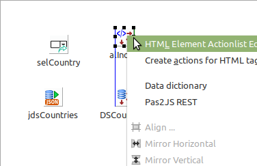
You don't need to create these actions manually. In the context menu there is an item "Create actions for HTML tags"
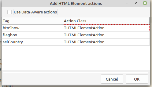
This menu will pop up a wizard that finds all elements for which no action exists yet, and proposes to create an action:
If you check the Use Data-Aware Actions checkbox, then DB-Aware actions will be used. These can be used as button actions (to navigate in the data, insert/post/delete etc. etc)
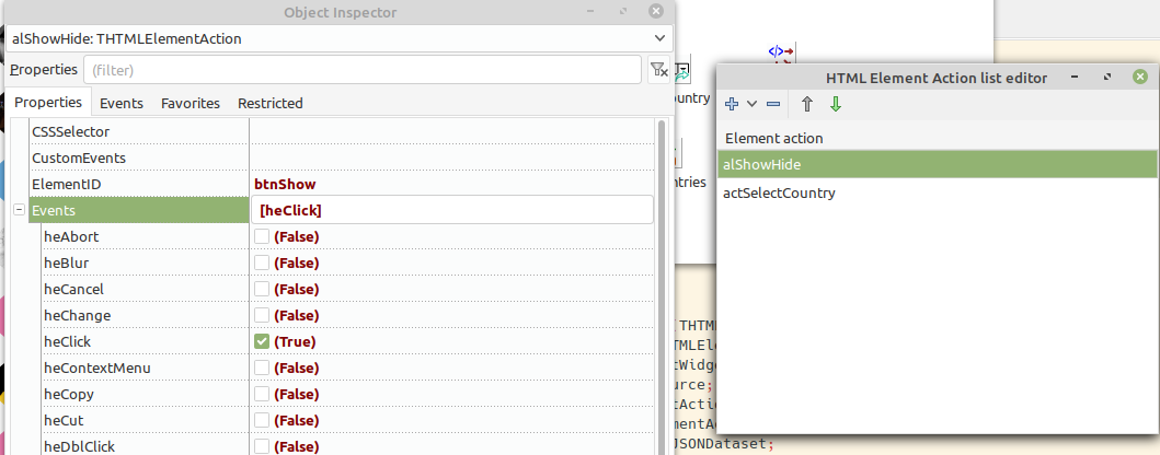
The action editor works similar to the LCL action list editor:
The main properties of an action are:
- ElementID the ID of the element you want to control.
- CSSSelector A css selector for thes element you want to control in case of multiple elements (e.g. to get all rows in a table use #tableid tr)
- Events a set of events to listen for. When the event is triggered, the OnExecute event handler is executed.
- CustomEvents a space separated list of HTML to listen for, for events that do not appear in **Events**
- PreventDefault can be set to True to prevent the default HTML action from happening.
- StopPropagation can be set to True to prevent the event from bubbling, i.e. propagating to parent elements.
TBootstrapModal
A component (similar to the LCL Dialog components) to show a modal dialog using Bootstrap. (you need to include the various bootstrap files in your project HTML file)
The following properties exist:
- ShowOnRender set to True if you wish to show the modal as soon as it is rendered (meaning, the HTML was generated).
- BackDrop show a backdrop shadow over the rest of the HTML page.
- KeyBoard Allow keyboard actions
- Focus set focus to the modal.
- Template the HTML for the modal.
- TemplateName the name of a template in TempateLoader containing the modal HTML.
- TemplateLoader a custom template loader. If not set, a global template loader is used.
- References a collection of CSS Selectors which can be used to get a reference to elements in the modal. These can be used to retrieve entered values during the **OnHide** event handler..
The following events exist:
- OnHide event triggered when the modal is hidden.
TBootstrapToastWidget
The TBootstrapToastWidget allow you to show a small Toast message.
It can show a toast embedded in the HTML file, or the HTML can be generated from the properties
- Header a string with the HTML for the header tag.
- SmallHeader a string with the HTML for the sub (smaller) header tag.
- Body a string with the HTML for body of the modal.
- HeaderImage an URL for the header image.
- CloseButton set to True to add a close button to the dialog.
- Contextual an enumerated which allows you to select one of the primary bootstrap color schemes.
- HideDelay a number of milliseconds before the toast automatically disappears when AutoHide is True.
- AutoHide set to True to let the toast disappear automatically after HideDelay milliseconds.
- Animate set to True to animate showing and hiding of the modal.
- MinWidth minimum width for the modal.
- UnrenderOnHide if set to True the HTML of the toast will be removed from the DOM when the toast is hidden.
The following event exists:
- OnHide triggered when the toast is hidden.
TTemplateLoader
This component can be used to load HTML fragments (in fact, any file) when the webapplication is run.
When loaded, the templates are available in a named array Templates where the index is the name of a template. The list of templates to load can be specified in the PreloadTemplates property, a collection.
The following properties exist:
- BaseURL all filenames for templates are relative to this URL.
- CheckResources When loading a template, check if a resource with the same name as the template exists. If yes, load the template from the resource.
- PreloadTemplates List of templates to load as soon as the component is loaded from the form file.
The following events exist:
- OnLoad triggered when a template is loaded. The name of the loaded template is passed to the event handler.
- OnLoadFail triggered when a template fails to load. The name of the loaded template is passed to the event handler.
Because the loading happens asynchronous, the following method is useful:
Procedure IfTemplate(const aName : String; aEvent : TTemplateNotifyEvent);
this method will check if template aName is loaded, and calls aEvent if it is. If it is not yet loaded, it will wait till the template is loaded and then call the event.
Additional templates can be loaded with the following 2 calls:
Procedure LoadTemplate(Const aName,aURL : String; aOnSuccess : TTemplateNotifyEvent = Nil; AOnFail : TTemplateErrorNotifyEvent= Nil);
Procedure LoadTemplates(Const Templates : Array of String; aOnSuccess : TTemplateNotifyEvent = Nil; AOnFail : TTemplateErrorNotifyEvent= nil);
These methods will load a template, even if it was already loaded before. In case of the array, there must be an even number of elements, the odd elements are template names and the even elements are corresponding filenames.
TSQLDBRestConnection
TSQLDBRestDataset
TDBBootstraptableWidget
A widget that renders a bootstrap-table table based on a dataset.
Bootstrap-Table can be downloaded here
It renders a read-only table with paging and search options, based on the properties set, and the data from a dataset:
The component has the following properties:
- StylingClasses a set of properties that affect how a column with a button is rendered. See below for the list of properties.
- Columns A column with the columns to render in the table.
- DataSource a reference to the dataset for which to render the table. The table is rendered when the dataset opens, it is unrendered when the dataset closes.
- Options a set of general options for the table behaviour.
- ViewOptions a set of options that determine the look-and-feel of the table.
- PaginationOptions a set of options that govern the pagination mechanism of the table.
- SearchOptions a set of options that control the search mechanism of the table.
- SortOptions a set of options that control the sorting mechanism of the table.
- DisplayReadOnly set all edit/delete buttons readonly.
- AfterBodyDraw event triggered after the table body has been rendered.
For each column to be rendered the following properties can be set:
- FieldName: The Fieldname for this column
- Title: The Title for this column
- RenderMode: The Render mode for the column: text, number, checkbox, button custom render
- ButtonType: When rendermode is rmButton, what button must be rendered.
- ButtonIconClass: When buttontype is btCustom, use the following class (in <i class=""></i>)
- OnTransformValue: Event called when rendermode is rmTransformValue
- OnCustomFormat: EVent called when rendermode is rmCustom
- Width: Column Width (in WidthUnits units)
- WidthUnits: Column Width (in CSS units)
- CSSClassName: a CSS Class name applied on cells for this column
- CheckBoxClassName: CSS Class name for this column if there is a check box.
- Visible: Visible column or not ?
- Searchable: A boolean that Indicates whether the column is searchable
- Sortable: A boolean that Indicates whether the column is sortable
- ButtonURL: string URL to use when the button is clicked
- ButtonURLTarget: link element target attribute.
The TStylingClasses has the following properties:
- CheckBoxClass a space-separated list of classes to apply to a checkbox column.
- ButtonClass a space-separated list of classes to apply to a button column.
- InfoClass a space-separated list of classes to apply to a info button column.
- EditClas a space-separated list of classes to apply to a edit button column.
- ReadonlyEditClass a space-separated list of classes to apply to a read-only edit column.
- DeleteClass a space-separated list of classes to apply to a delete button column.
TDBLoopWidget
A widget that renders a HTML template for every record in a dataset. The HTML templates can contain placeholders in the form Template:FieldName which will be replaced with the field value of the dataset for that record.
The Groups collection can be used to make groups based on the values in the dataset: when the group value changes, a new group is started and the header template for the group is rendered. When a group ended, a footer template is rendered for that group.
The following properties exist:
- HeaderTemplate The header template is rendered before starting the loop.
- ItemTemplate The Item template is rendered for each record in the dataset.
- FooterTemplate The footer template is rendered before starting the loop.
- OnGetValue event called to get the value of a placeholder.
- References use CSS selectors to get references to the nodes in the rendered content;
- Datasource a reference to the data for which to render the loop.
- OnFormatField an event to get a custom formatted version of a field.
- Groups a collection of groups for which an expression, a footer and header template can be specified.
- OnGetGroupValue to get a custom value for a group expression.
TDBSelectWidget
A widget which renders a html SELECT element based on data in a dataset.
The following properties are available:
- Datasource a reference to the data from which to generate the SELECT element.
- ItemField the field whose value is used to create an OPTION element in the SELECT.
- ValueField when set, the field whose value is used to set the value attribute of an OPTION element in the select.
- NullIsNotValue if a field is null, no value is generated.
- SelectedIndex set the selected item index.
- Multiple allow multiselect.
