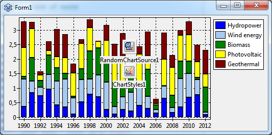
TAChart Tutorial: Stacked BarSeries
WORK IN PROGRESS NOT FINISHED
Introduction
In the BarSeries tutorial we had demonstrated how to create a chart with bar series arranged in a side-by-side manner. Stacked bars are another popular variant of bar charts where the grouped data are drawn stacked onto each other. In this way, the individual contributions and their sum can be shown within the same plot. There is also a variant in which the total bar heights are normalized to 100% to emphasize the relative contributions.
We'll apply this technique in this tutorial to plot the progress in generation of renewable energies during the last years.
As usual, you must have some basic knowledge of Lazarus, Object Pascal, and the key concepts of TAChart to follow the tutorial. If you have never worked with bar charts it is a good idea to look at the related tutorial explaining the side-by-side arrangement of bars.
Preparations
Setting up the chart
Create a new project. Add a TAChart component, and align it alClient to completely fill the form. Maybe you should increase the size of the form a bit, but you can do this later when you see the data.
Temporary data
Before using the "real data" we'll arrange and format the chart to our liking. For this purpose it is important to get a quick response. Therefore, we propose to use a TRandomChartSource linked to the BarSeries. This allows us to optimize the appearence of the chart without having to recompile the project again and again, there is an immediate response to changes made in the Object Inspector. Of course, at the end, we will remove the RandomChartSource and add the data of interest.
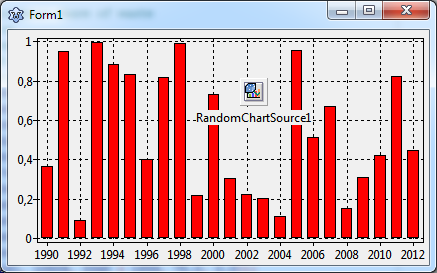
So: add a TBarSeries and a TRandomChartSource to the form, and link the RandomChartSource to the Source property of the BarSeries. (If you need more details have a look at the other BarSeries tutorial). Select the ChartSource, and set PointsNumber to 10, XMax to 1, and YMax to 1 (or any other numbers that you prefer - we will use "real" values later). Now the red bar series pops into the chart:
Multiple y values
If you read that tutorial you may be surprised now: In that tutorial, we had used a single series for each group of bars. In our final "Renewable energy plot" there will be several types of bars, one for each enerty type. So, shouldn't we add some more series?
No. We only need one since we cannot follow the strategy of the side-by-side series here. This is because TAChart cannot stack the bars of different series onto each other. Each bar is drawn from a common "zero level" up (or down) to the data value - no way to shift the next bar up to the end of the previous bar.
What to do?
For stacking of series, TAChart offers the special concept of multiple y values per series data point. If you look into unit TACustomSource you'll find the record
type
  TChartDataItem = packed record
  public
    X, Y: Double;
    Color: TChartColor;
    Text: String;
    YList: TDoubleDynArray;
    ...
  end;
This is the internal structure of the data plotted in a series. Besides the usual x and y coordinates which you know from other plot types and other tutorial, there is also a data field YList which contains additional y values. The chart source provides a property to define the length of the YList. In case of the RandomChartSource, this is the property YCount - select the RandomChartSource and have a look at the Object Inspector. But you should know that YCount includes also the standard y value, the length of the YList array for the other y values is smaller by 1.
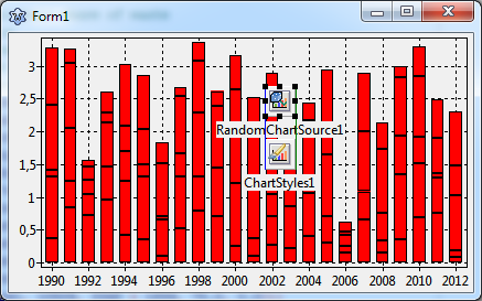
Our final plot will contain six column types ("hydro power", "on-shore wind", "off-shore wind", "bio mass", "photo-voltaics", and "geothermics"). Therefore, enter 6 for YCount. This creates stacks of 6 bars.
Using ChartStyles
Unfortunately, all bars are in the same color. How can we modify the color of each bar level?
We need another component to address this: ChartStyles. This is a collection of TChartStyle components which allow to modify the appearance ("style") of each set of bars.
Go to the component palette, find the 9th icon (the one with the brush in front of the colored bars), and add the component to the form.
At first you have to link the BarSeries to the ChartStyles component. The series has a corresponding property Styles for this purpose.
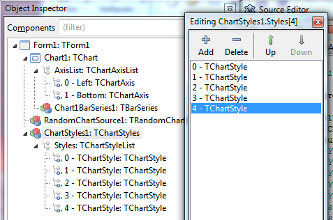
Then, select the component, and go to its Styles property in the Object Inspector. Click on the ellipsis button (...) to open the ChartStyles editor. Here you can add a style for each group of bars by clicking on the + button six times. Alternatively you can right-click on the Styles node in the Object Tree of ChartStyles1 and select "Add item".
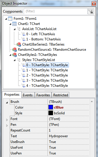
In the the ChartStyle editor you can select each style and you'll see the style's properties in the object inspector. The TChartStyle item with the index 0 belongs to the bottom-most bar. Index 1 belongs to the next bar, etc. For changing the color of the bars, modify the Brush.Color of the style. The chart immediately updates and displays the corresponding bar in the new color. Repeat this with every Style.
