Difference between revisions of "Industrial"
(→TmKnob: Documentation of TmKnob) |
(→TmKnob) |
||
| Line 128: | Line 128: | ||
* '''Demo''' | * '''Demo''' | ||
| − | ** Used | + | ** Used, among other ''industrial'' controls, in the project in the ''Example/OnOffSwitch_Knob_Sample'' folder |
[[image:OnOffSwitch Knob Sample.png]] | [[image:OnOffSwitch Knob Sample.png]] | ||
Revision as of 22:30, 27 March 2023
About
The Industrial package contains a set of industrial-themed components, such as LED indicators, seven-segment displays, analog gauges, thermometer gauges, knob, on/off switch, etc.
Download and Installation
- Released version distributed by the Online Package Manager: check the "IndustrialStuff" item in the Online Package manager, click the "Install" button and follow the instructions.
- Development version on Lazarus CCR (svn):
- If you have access to svn use the following command to check-out the package into folder industrialstuff:
svn checkout svn://svn.code.sf.net/p/lazarus-ccr/svn/components/industrialstuff industrialstuff - Otherwise download the zipped snapshot from https://sourceforge.net/p/lazarus-ccr/svn/HEAD/tree/components/industrialstuff/. Extract the files in a separate directory.
- If you have access to svn use the following command to check-out the package into folder industrialstuff:
- In the Lazarus IDE, open the file industrial.lpk in "Package" > "Open Package File (.lpk)" and click on "Use" > "Install". Allow to rebuild the IDE.
- When Lazarus restarts after the installation the components are on palette Industrial.
License
Since the components contained in the industrial package originate from various authors there is no general, package-wide license. Licenses used are MPL, GPL and modified LGPL. Please check the unit headers for the license of the component that you want to use.
Components
LED Indicators
TAdvLED
![]() Indicator light as LED or light bulb
Indicator light as LED or light bulb
- Properties
- Kind (enumeration TLEDKind = (lkRedLight, lkGreenLight, lkYellowLight, lkBulb, lkCustom)): red, green or yellow LED, or light bulb, or LED in adjustable colors as defined by the GlyphDisabled, GlyphOff and GlyphOn properties.
- State (enumeration TLEDState = (lsDisabled, lsOff, lsOn)): Indicator is disabled (gray), OFF (dark color) or ON (bright color).
- Blink: boolean: The LED toggles automatically between ON and OFF states. The duration during which the LED is in each state is given by the property BlinkDuration (in milliseconds).
- FlashMode (enumeration TFlashMode = (fmFlashOffToOn, fmFlashOnToOff)): Defines whether the Flashmethod causes a transition from OFF to ON, or from ON to OFF.
- Methods
- procedure Toggle: Switches between the states of the indicator (unless State is lsDisabled).
- procedure Flash(ADuration: Integer): The indicator flashes for the ADuration time (in milliseconds) to the other state and then returns to the current state again. Whether the transition is from OFF to ON or from ON to OFF is specified by the FlashMode property.
- Demo project
- in folder TAdvLED of the installation folder.
TIndLED
![]() LED indicator with configurable shape and color. Can be grouped with others so that only one LED of that group is active.
LED indicator with configurable shape and color. Can be grouped with others so that only one LED of that group is active.
- Properties
- Bevels: a collection of TcyBevel items defining bevels around the LED (raised/lowered, left/top/right/bottom, highlight and shadow color, as well as bevel width)
- GroupIndex: Integer: in a group of LEDs sharing the same non-zero GroupIndex only a single LED can be lit. When AllowAllOff is true all LEDs of this group can be turned OFF, otherwise there must always be one LED which is ON.
- LedColorDisabled, TLedColorOff, TLedColorOn (type TColor): colors of the LED in the disabled, OFF and ON states, respectively.
- LedValue: boolean: determines whether the LED is ON (true) or OFF (false).
- ShapeType (enumeration TShapeType = (stRectangle, stRoundRect, stEllipse)): shape of the LED. In case of stRoundRect the corner radius is determined by ShapeRoundRectX and ShapeRoundRectY.
- ShapeLedColorDisabled, ShapeLedColorOff, ShapeLedColorOn (type TColor): pen color of the border of the LED shape.
Displays
TLEDNumber
![]() 14-segment LED display for alpha-numeric text.
14-segment LED display for alpha-numeric text.
Based on a component contained in the TurboPower VisualPlanIt library. Lazarus port by Jurassic Pork.
License: MIT.
- Properties
- BgColor: TColor: Specifies the color of the display's background (default: clBlack)
- Borderstyle (Enumeration TLedNumberBorderStyle = (lnbNone, lnbSingle, lnbSunken, lnbRaised): Defines the border around the control.
- Caption: string: String to be displayed by the component. Note that TLEDNumber is able to display only the following characters: ' ', '*', '+', ',', '-', '.', '/', '0'..'9', '<', '>', 'A'..'Z', 'a'..'z', ':'. Other characters are replaced by spaces.
- Columns: Integer; Rows: Integer: The Caption is displayed in predefined cells of a grid consisting of as many columns and rows as specified by these properties.
- OffColor: TColor: Specifies the color of the un-lit (darkended) segments.
- OnColor: TColor: Specifies the color of the lit (bright) segments.
- Size: Integer: Size of the display. To be exact, this is the width of the segments in pixels. Allowed values are between 2 and 10.
- Slanted: Boolean: If true, the characters are drawn slanted by the amound specified in the SlantAngle property.
- Transparent: boolean: If true, the display's background (BgColor) is not painted.
- ZeroToO: boolean: If true, zero digits ('0') are not drawn with the inner slash and thus are identical with the upper-case 'O'.
TLCDDisplay
Gauges
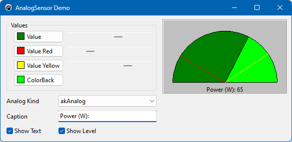
TAnalogSensor
![]() Analog display which can be configured to have a round or linear scale. Display ranges can be indicated in different colors.
Analog display which can be configured to have a round or linear scale. Display ranges can be indicated in different colors.
Original author: Mike Skolnik (http://www.scalabium.com), Lazarus port by Jurassic Pork.
License: "My components are freeware for private and commercial use so you may use any in your applications but without any warranties from my side."
- Properties
- AnalogKind (enumeration TAnalogKind = (akAnalog, akHorizontal, akVertical)): type of the display: round scale (akAnalog) or horizontal (akHorizontal) / vertical (akVertical) thermometer-like linear scale
- ColorBack: TColor: Color of the display background (default: black)
- ColorFore: TColor: Color of the display "foreground"; the fraction of the area painted by the ColorFore corresponds to the displayed Value (default: bright green).
- ColorRed, ColorYellow (type TColor): Color of two lines indicating special data ranges, e.g. value too small or value too high. Default: red and yellow, respectively. These lines are displayed when the ShowLevel property is true
- ShowLevel: boolean: If true, two lines indicating special data conditions are displayed.
- ShowText: boolean: Displays the numerical Value below the display.
- Value: integer: Displayed number (corresponds to the area drawn in color ColorFore)
- ValueMax: Integer: Maximum value that can be displayed
- ValueMin: Integer: Minimum value that can be displayed
- ValueRed, ValueYellow: Integer: Values displayed as the position of the indicator lines drawn in color ColorRed and ColorYellow, respectively.
- Caption: string: Text displayed in front of the value when ShowText is true.
- Methods
- SetColorState(slStopLight: TStopLights): Changes the color of the Caption and the Value as specified by the parameter slStopLights: TStopLights = (slUNKNOWN, slRED, slYELLOW, slGREEN).
- Demo project
- in folder Example/AnalogSensor
TA3nalogGauge
TindGnouMeter
Control Elements
TmKnob
![]() Emulates the volume knob found on some HiFi devices.
Emulates the volume knob found on some HiFi devices.
Original author: Marco Caselli (mcaselli@iname.com). Lazarus port and extended by Werner Pamler.
License: "Feel free to use or give away this software as you see fit. Please leave the credits in place if you alter the source."
- Properties
- AllowUserDrag: Boolean: If true, the user can drag the control to a new value by using the mouse.
- AngleRange: TKnobAngleRange = (arTop270, arTop180, arTop120, arTop90, arBottom270, arBottom180, arBottom120, arBottom90, arLeft270, arLeft180, arLeft120, arLeft90, arRight270, arRight180, arRight120, arRight90): Defines the sector of the full circle over which the knob can be rotated. Default: arTop270
- FaceColor: TColor: Color of the knob's face
- MarkSize: Integer: Size of the tick mark. Depending on the value of the MarkSizeKind property, the size is given either as percentage of the knob's enclosing rectangle size, or in pixels. Default: 20%
- MarkSizeKind: TKnobMarkSizeKind = (mskPercentage, mskPixels): Determines whether the knob's tick mark size is given as percentage or in pixels. Default: mskPercentage
- MarkStyle: TKnobMarkStyle = (msLine, msCircle, msTriangle): Specifies the style of the tick mark: line, circle, or triangle. Default: msLine
- Max: integer: Upper limit value for Position. Default: 100
- Min: integer: Lower limit value for Position. Default: 0
- Position: Integer: Current position of the knob ("value")
- RotationEffect: Boolean: If true, the knob will shake emulating a visual effect of rotation. Default: false
- Shadow: Boolean: If true, a shadow is drawn in the ShadowColor at the bottom/right side of the knob.
- ShadowColor: TColor: Color of the knob shadow.
- TickColor: TColor: Color of the tick's mark
- Transparent: Boolean: If false, the outer area of the control's client rectangle will be painted in the Color specified in the corresponding property, otherwise it is transparent.
- Events
- OnChange: TKnobChangeEvent: This event is triggered whenever the knob's Position is changed by user interaction or by code. Besides the Sender the event has the new Position value as a parameter.
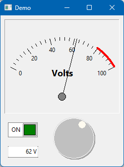
- Demo
- Used, among other industrial controls, in the project in the Example/OnOffSwitch_Knob_Sample folder

